Why Spotify’s navigation is broken — Medium
Save article ToRead Archive Delete · Log in Log out
5 min read · View original · medium.com/@nabeelkhalid


Why Spotify’s navigation is broken
Re-imagining the Spotify experience
If you’re like me, you use Spotify a lot, in fact when Apple Music came out I tried it and I went from a Free Spotify user to a paid one. That’s how great I think Spotify is. I tend to use Spotify 40% on my smartphone and 60% on the desktop.
Using Spotify on the desktop is fast and what you expect from a great music client. On the phone it’s a whole another story. Let’s start with the navigation.

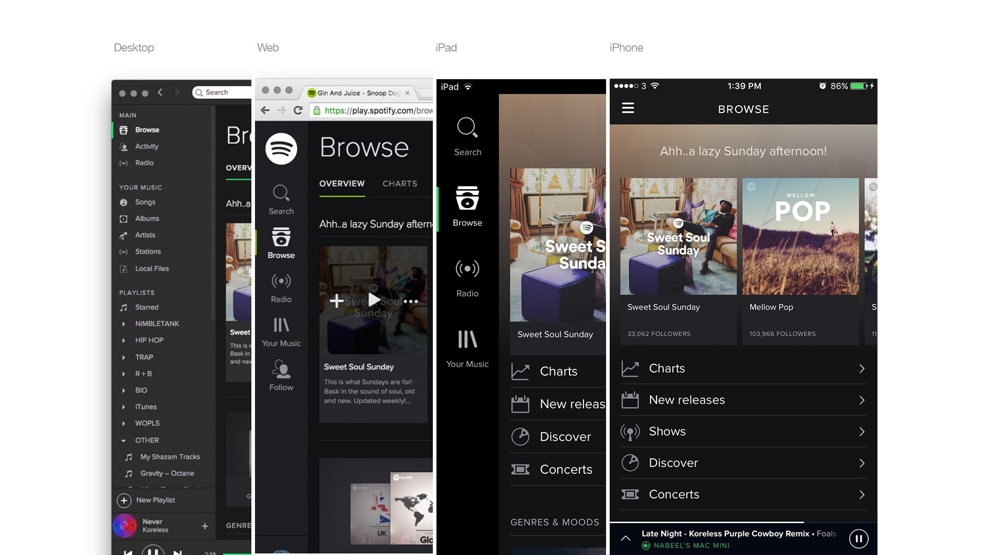
As you can see from the image above Spotify uses a fixed left hand navigation system through out their design across different platforms, apart from iPhone. They even use it on the iPad but not on the iPhone. The inconsistency in the navigation from mobile, tablet and across to desktop makes it confusing when switching from different platforms.
With a persistent navigation, it’s more clear to the user to see what section they are on and where they’d like to go in the app. This would also make the navigation more consistent to use across different platforms. By using a persistent navigation the user will be able to use the app instinctively without thinking about it.
Steve Krug a well known information architect and user experience designer who wrote the best seller “Don’t make me think”. In this book Steve makes it clear that a persistent navigation is key to a good user experience.
Another good mention would be this article by Anthony Rose of Beemly (formerly Zeebox). Anthony wrote an article based on his finding from A\B testing persistent navigation(sliding tabs) and the side menu on Android.

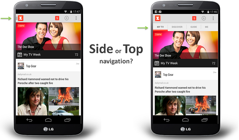
My take-away from all of this is that if most of the user experience takes place in a single view, and it’s only things like user settings and options that need to be accessed in separate screens, then keeping the main UI nice and clean by burying those in a side menu is the way to go.
The article also covers how Facebook also trialled the side navigation system. Facebook’s findings also mirrors that of Anthony’s.
One interesting thing Anthony covers in his article is how the side menu is a standard navigation pattern for Android, and how Android users wanted the side menu to be implemented in the app. Once implemented in the app, the apps 5 star ratings soared. But usage plummeted. This is the basic principle of ascetics design over user ability.

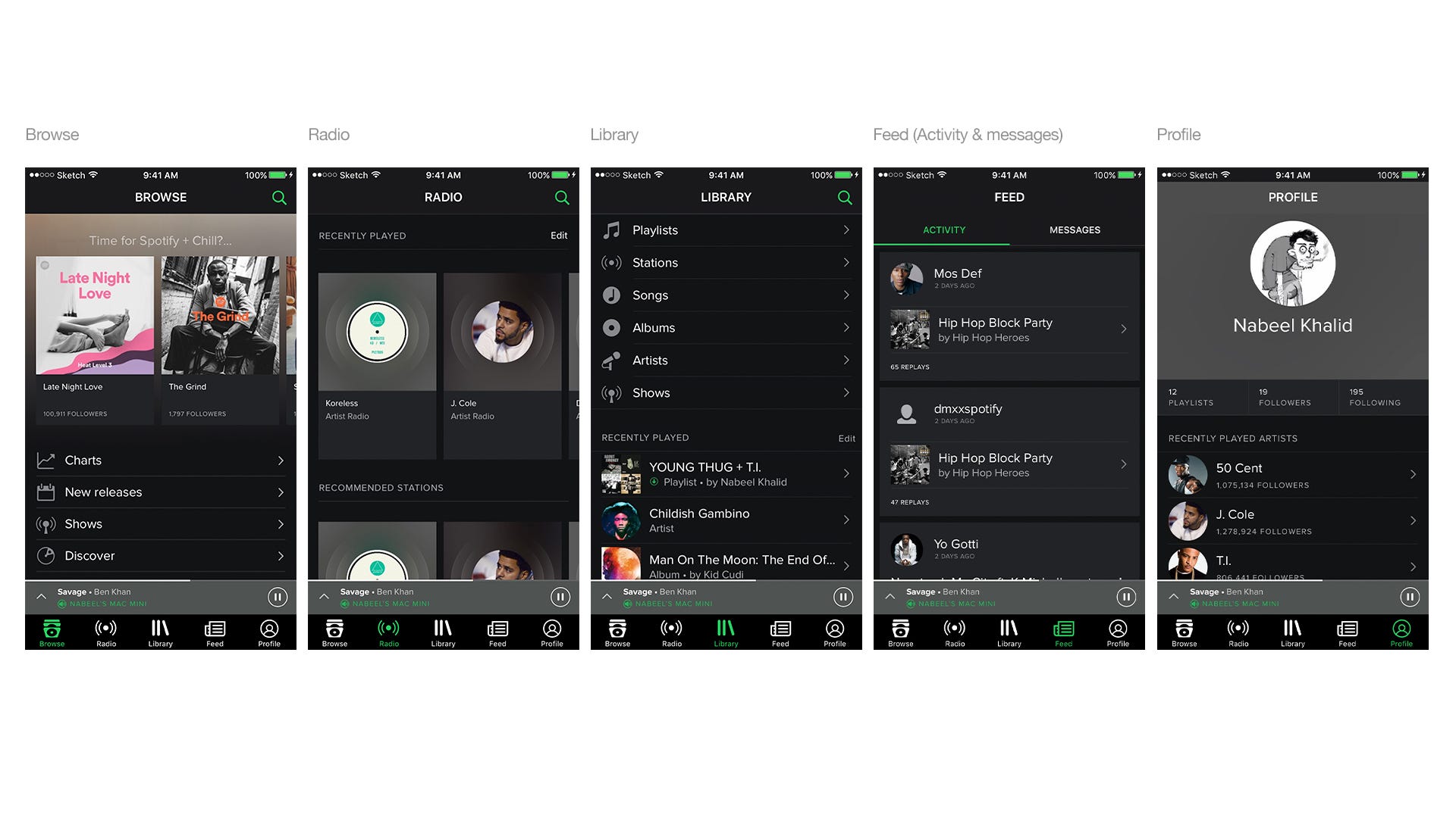
Proposed Re-design
The Spotify app as a whole is designed well visually but in terms of user experience it feels quite frustrating to use. Below are three journey a tab bar solution would solve.
Search Comparison
The current method of search is frustrating to use. After searching what you want there is no easy way to exit the search view. You have to use the side menu to access the search view and exit. This feels wrong. The standard iOS pattern for search is have a cancel button to close the search but with the current Spotify design the user must use the side menu button to ‘cancel’ or exit their search query.
I have used the standard iOS design pattern for search view and it works. Search has also been placed in the browse section of the app as well as radio. My reasoning for this is that most people who browse for new music will also search for it too. Also this is the first screen the user lands on when they open the app. Unlike the current app which opens to a offline view first.
Exiting a section — several levels deep
If you’ve ever tried to search for a specific track, and then found yourself several levels deep inside a random album you’ll be wondering how do I exit this mess? What do I do now? You can’t just quit the app because it’ll just load up were you have just left off so you have to navigate back all the way to the side menu.
With a tab navigation you can just change tabs or tap on the current tab to exit to the route level. This simple function was used since the first iPhone and the majority of user know this.
Activity feed & new features
The feed is the most unappreciated section inside Spotify. It’s the sections that tells you what your friends are listing too and which artists you follow release new music on Spotify. All this is ignored and stuffed at the bottom right corner of the side menu. Like Spotify running and shows, the activity feed is lost in the noise.
As Spotify grows new features are expected. Burying them inside a side menu feels neglectful. You could easily switch out one or more of the section within the tab bar to make it more accessible.
Conclusion
While Spotify as a whole is well designed it’s frustrating to use.
From this small design exercise I believe a persistent navigation would solve most of Spotify’s problems but not all. The persistent nav could be designed in any way but the sections Spotify decided to use needs to be researched. Like does the search function need its own section? Do users care about radio? Could radio be placed inside the browse section? As the mobile screen is quite small you want it the most meaningful content first and above the rest.
There are a few things I would change from my designs in this post. One being the search, I’d place it in the navigation as it’s a section on it’s own. Two would be to see how to scale the navigation to handle new features. Third and finally I would see how the activity feed could be redesigned.
Finally what about Android? Well you could use sliding tabs and a over flow menu for everything else or a tab bar.

Tools
For this exploration I used Sketch to design and Flinto to prototype. You can download the Flinto prototype here.
You can use Marvel app or Principle for the prototypes. Same goes from Sketch, you could use photoshop. But you shouldn’t.
Please share and comment.