The Curtain Menu: A mobile alternative to the desktop drop-down menu — Medium
Save article ToRead Archive Delete · Log in Log out
4 min read · View original · medium.com/@supjoey
A new mobile navigation menu
Converting the desktop dropdown nav
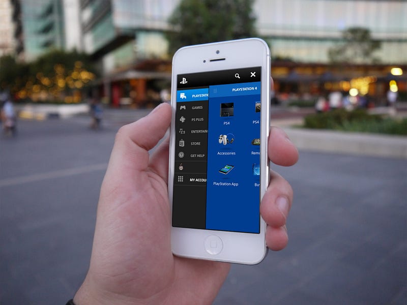
I designed this menu for PlayStation.com and it went through several internal drafts and prototypes before going through usability testing with Nielsen Norman Group.


From desktop to mobile
I was tasked with optimising the user experience of our website navigation for mobile devices. It became clear that the drop-down menu as a user interface element has firm roots in desktop design because two factors native to these devices allow for an acceptable experience.


- Mouse input allows the user to hover, conveniently revealing content without need for additional clicks or taps.
- The landscape ratio of a desktop screen allows content to span across a horizontal axis.
Unfortunately neither of these points are applicable to mobile devices because of their touch-screen input and (primarily) portrait orientation. This prevents the drop-down menu from converting well to mobile in its current form.
Existing mobile navigation patterns
While researching mobile navigation I noticed two common patterns for mutli-level menus. Both come with their own pros and cons.
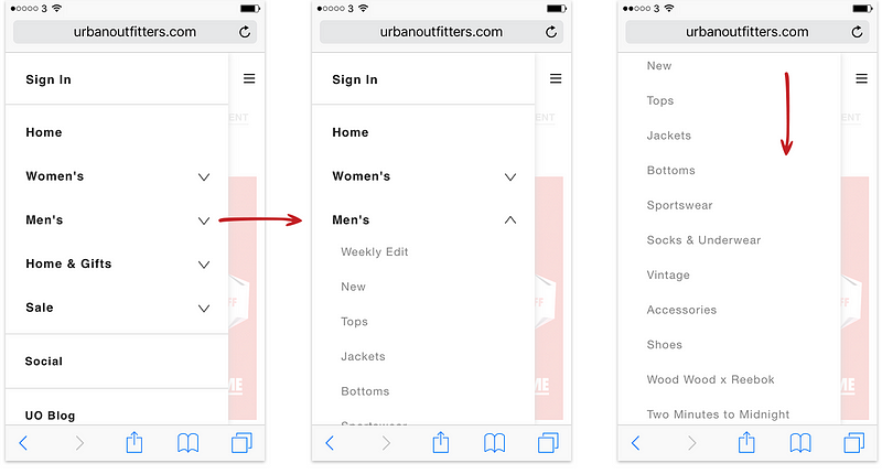
1. The Accordion Mechanic
The user choses from a set of primary links, which ‘expand’ to reveal secondary links. When the menu is initially opened the user can clearly see all primary links.
However you can see from the example below that if a category contains many links, once a user makes their selection there is the potential for other categories to get pushed off the screen. If a category contains a long list of links it may also push primary links off the screen altogether, requiring the user to scroll or collapse sections to navigate between categories.


An improvement would be a menu which retains visibility of all categories even once a selection is made
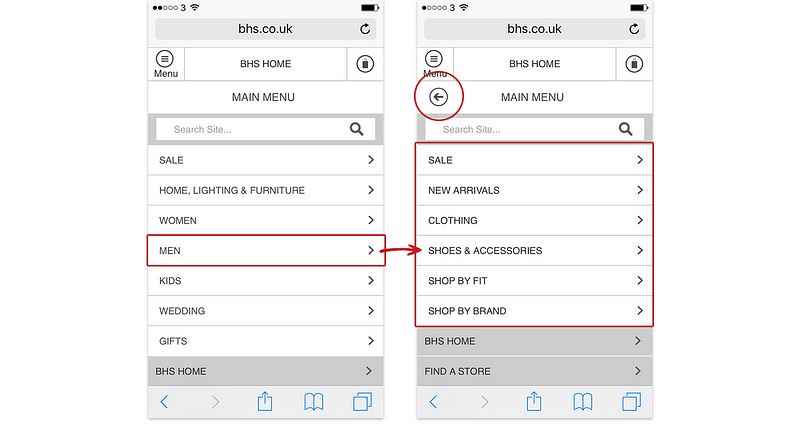
2. The Back Mechanic
Another common solution for displaying multiple levels of links is to use a ‘back’ button .This method shows a set of primary links which are hidden once the user makes a selection until they navigate ‘back’ or ‘up’ to the previous level.


The problem for me is that in addition to removing the primary links altogether, this adds an additional step to navigation.
An improvement would be a menu which allows the user to switch between categories without an unnecessary tap
With this in mind I wanted to design a menu which improves on these two points.
The Curtain Menu
A different mobile menu for multi-level navigation, which uses sliding layers like a pair of curtains.
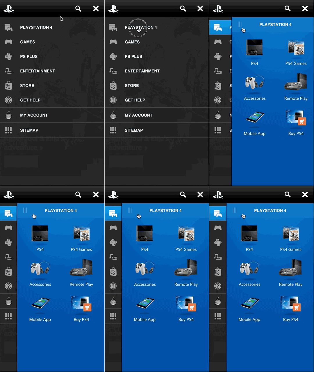
Just like its desktop drop-down menu counterpart, the content is split into two levels. One primary set of links, each containing a group of secondary links. Both levels of links are displayed at the same time.

Because horizontal screen space is limited on devices with a portrait orientation links stack on top of one another instead of side-by-side.
When the user opens the menu, the left curtain slides in to display the primary set of links.
Both levels of links are displayed at the same time.
When the user makes a selection, the right curtain, containing secondary links, slides in to view. All the top-level categories remain visible, preventing the need to collapse or go back. I use animation on the overlapping layers to teach the user a sense of hierarchy.

The use of icons within the left curtain allows the right curtain to expand almost fully, optimising the available screen space. The icons also double as sign-posts for users wishing to navigate across categories quickly.
Icons aren’t always explicit enough to make sense without a description, so labels are included to help educate users.
All the top-level categories remain visible, preventing the need to collapse or go back.
The users sees both the icons and labels used for the primary links when they open the menu for the first time. This not only teaches the user the basic mechanic of the menu but also informs them of the categories available. Once a user has navigated to a secondary link, when the menu is next opened it will reveal both curtains straight away, to prevent the user having to select the initial category each time. I including a handle on the overlapping right curtain, so users wishing to see the category labels can slide it back across.

Generally there’s enough vertical space to fit a logical amount of categories within the left curtain, without any need to scroll (however this is an option). If the right curtain contains a large set of links, the user can scroll the contents of the curtain up and down. A small fade on the bottom of the curtain is used to indicate more content is available.
Future iterations
I believe good design is iterative so I welcome your feedback or comments :)
Update:
Thank you for all your responses. Although usability testing revealed no issue with users being able to identify the function of the hamburger menu, I do think it’s worth testing an alternative way of launching the menu. One such way might be to use a “menu” button on the left, relocating the logo to the middle.
I’ll add this iteration to a future test.