Stop Maiming Bodies: The Perils of Pixel Font-Size
Save article ToRead Archive Delete · Log in Log out
3 min read · View original · sitepoint.com
Artwork by SitePoint/Natalia Balska
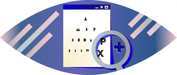
Imagine you’re visually impaired or have a reading disability. The browser comes with a font size setting built in, so you increase the default font size and you start browsing. Oddly, the text on most sites still seems small, so you go back to the browsers settings and increase font size to huge. You return to the website you were on and… nothing. The setting has no effect.

Past few years, we have learned how to use and gradually accepted relative units for typographic content. Instead of using pixels for properties like font-size, most values are rem or ems.
Many developers still set an ‘initial’ font-size on the html or body tag, often using px as unit. If you don’t fully understand (and appreciate) relative units, this might be convenient for you, as all em and rem are now relative to that initial value.
/* A body containing a font-size with absolute value */
body { font-size: 14px; }

/* The h1 will be 2em relative to 14px */
h1 { font-size: 2em; }
Unfortunately, that initial value isn’t convenient for some users. You see, that browser setting I mentioned earlier, only sets the base font size. Every absolute unit (px, pt, inch, etc.) you use, overwrites that.
/* Fictional browser setting */
html { font-size: 18px; }
/* The absolute unit in the body overwrites the browser setting */
body { font-size: 14px; }
As a result, users who change the browser’s font size setting will still see text in 14px, even though they explicitly set the font size to something larger.
Many sites, even high-profile ones, are guilty of this sin:
The Difference Between Zooming and Font Size
One of the arguments I get is: “Zooming works, isn’t that the same thing?”
Pretty much all browsers have the ability to zoom in, which enlarges the entire page. Technically, it enlarges every unit, except for percentages. This is great for the visual impaired, like users suffering visual acuity (clarity). Most visual acuity can be corrected using glasses, but in too many cases, it can’t.
Changing the browser’s font size, however, exclusively changes the base font size. Some people have perfect vision, but have a reading disorder, like Dyslexia. In fact, 3-7% of the population suffer from Dyslexia, but up to 20% can experience its symptoms. Increasing font size can decrease the symptoms’ severity. Why should they zoom into a page, when they have the ability change the font size only?
The Right Way
Absolute units are the bad guys here. If we use relative units, like % and em, the browser’s settings are respected. By default, 1em is approximately 16px. So, if you really want to use a non-default font size, you can set font-size to .875em or 87.5% for 14px.
/*
These are equivalent:
- font-size: 100%;
- font-size: 1em;
- absent font-size property
*/
body { font-size: 1em; }

/* If the users changes the browser setting, both the body text and h1 text will scale accordingly */
h1 { font-size: 2em; }
Sites doing it right:
Conclusion
More from this author
Absolute units for typographic properties is a common practice in the industry. Probably because it’s explicit, whereas relative units require some digging to find out why a deeply nested element may have a different computed font-size than an element in the body.
The problem is that it is a major accessibility flaw. To make the web great for the visual impaired or those with a reading disability, we have to use relative units.