No UI is the New UI — The Startup — Medium
Save article ToRead Archive Delete · Log in Log out
9 min read · View original · medium.com/swlh
No UI is the New UI
On the rise of UI-less apps and why you should
care about them as a designer.
October 23, 2015 • 8 minutes read
A couple of months ago, I shared with my friends how I think apps like Magic and Operator are going to be the next big thing.


If you don’t know about these apps, what make them special is that they don’t use a traditional UI as a mean of interaction. Instead, the entire app revolves around a single messaging screen. These are called ‘Invisible’ and ‘Conversational’ apps, and since my initial post, a slew of similar apps came to market. Even as of writing this, Facebook is releasing M, a personal assistant that’s integrated with Messenger to help you do about anything.
While these apps operate in a slew of different markets, from checking your bank account, scheduling a meeting, making a reservation at the best restaurant to being your travel assistant, they all have one thing in common: they place messaging at the center stage.
The Rise of Messaging

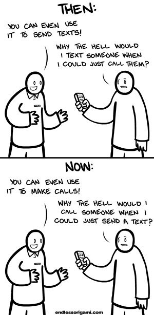
Matti Makkonen is a software engineer who passed away a couple of months ago. My guess is that you didn’t hear of his death, and you most likely don’t know who he was. However, Makkonen is probably one of the most important individuals in the domain of communications. And I mean — on the level of Alexander Bell — important. He is the inventor of SMS.
If you didn’t realize how pervasive SMS has become today, think again. SMS is the most used application in the world. Three years ago, it had an estimated 4 billion active users. That was over four times the numbers of Facebook users at the time. Messaging and particularly SMS has been slowly taking over the world. It is now fundamental to human communication, and it is why messaging apps such as WhatsApp and WeChat are now worth billions.
While messaging has become center to our everyday life, it’s currently only used in the narrow context of personal communications. What if we could extend messaging beyond this? What if messaging could transform the way we interact with computers the same way it transformed the way we interact with each other?
Enters A.I.
In the recent movie Ex Machina, a billionaire creates Ava, a female-looking robot endowed with artificial intelligence. To test his invention, he brings-in a young engineer to see if he could fall in love with her. The whole premise of the movie is centered around the Turing test, a test invented by Alan Turing (also featured in the recent movie The Imitation Game) in order to determine if a artificial intelligence is equivalent of that of a human. A robot passing the Turing test would have huge implications on humanity, as it would mean that artificial intelligence has reached human level.

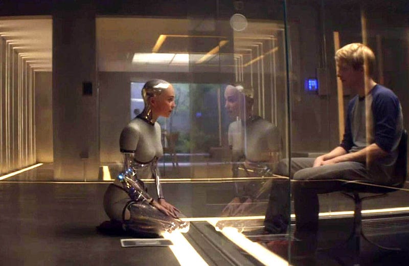
While we are far from creating robots that can look and act like humans such as Ava, we’ve gotten pretty good at simulating human intelligence innarrow contexts. And one of those contexts where AI performs best is, you’ve guessed it, messaging.
This is thanks to deep learning, a process where the computer is taught to understand and solve a problem by itself, rather than having engineers code the solution. Deep learning is a complete game changer. It allowed AI to reach new heights previously thought to be decades away. Nowadays, computers can hear, see, read and understand humans better than ever before. This is opening a world of opportunities for AI-powered apps, toward which entrepreneurs are rushing.
In this gold rush, messaging is the low-hanging fruit. This is because, out of all the possible forms of input, digital text is the most direct one. Text is constant, it doesn’t carry all the ambiguous information that other forms of communication do, such as voice or gestures. Furthermore, messaging makes for a better user experience than traditional apps because it feels natural and familiar. When messaging becomes the UI, you don’t need to deal with a constant stream of new interfaces all filled with different menus, buttons and labels. This explains the current rise in popularity of invisible and conversational apps, but the reason you should care about them goes beyond that.
Toward UI-Less Computer Interaction
The rise in popularity of these apps recently brought me to a startling observation : advances in technology, especially in AI, are increasingly making traditional UI irrelevant. As much as I dislike it, I now believe that technology progress will eventually make UI a tool of the past, something no longer essential for Human-Computer interaction. And that is a good thing.
One could argue that conversational and invisible apps aren’t devoid of UI. After all, they still require a screen and a chat interface. While it is true that these apps do require UI design to some extent, I believe these are just the tip of the iceberg. Beyond them, new technologies have the potential to disrupt the screen entirely. To my point, have a look at the following videos:
The first video showcases project Soli, a small Radar chip created by Google to allow fine gesture recognition. The second one presents Emotiv, a product that can read your brainwaves and understand their meaning through — bear with me — electroencephalography (or EEG for short). While both technologies seem completely magical, they are not. They are currently functional and have something very special in common: they don’t require a UI for computer input.
As a designer, this is an unsettling trend to internalize. In a world where computer can see, listen, talk, understand and reply to you, what is the purpose of a user interface? Why bother designing an app to manage your bank account when you could just talk to it directly? Beyond human-interface interaction, we are entering the world of Brain-Computer Interaction. In this world, digital-telepathy coupled with AI and other means of input could allow us to communicate directly with computer, without the need for a screen.
The Technological Tiller
In his talk at CHI 2014, Scott Jenson introduced the concept of a technological tiller. According to him, a technological tiller is when we stick an old design onto a new technology wrongly thinking it will work out. The term is derived from a boat tiller, which was, for a long time, the main navigation tool known to man. Hence, when the first cars were invented, rather than having steering wheels as a mean of navigation, they had boat tillers.

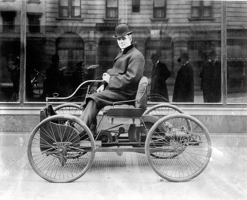
The resulting cars were horribly hard to control and prone to crash. It was only after the steering wheel was invented and added to the design that cars could become widely used. As a designer, this is a valuable lesson: a change in context or technology most often requires a different design approach. In this example, the new technology of the motor engine needed the new design of the steering wheel to make the resulting product, the car, reach its full potential.
When a technological tiller is ignored, it usually leads to product failures. When it is acknowledged and solved, it usually leads to a revolution and tremendous success. And if one company best understood this principle, it is Apple, with the invention of the iPhone and the iPad:

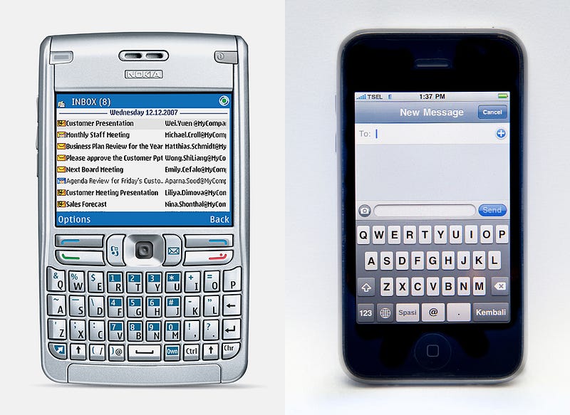
A technological tiller was Nokia sticking a physical keyboard on top of a phone. Good design was to create a touch screen and digital keyboard.

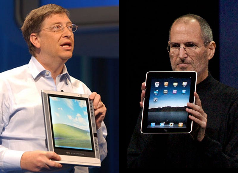
A technological tiller was Microsoft sticking Windows XP on top of a tablet. Good design was to develop a new, finger-friendly OS.

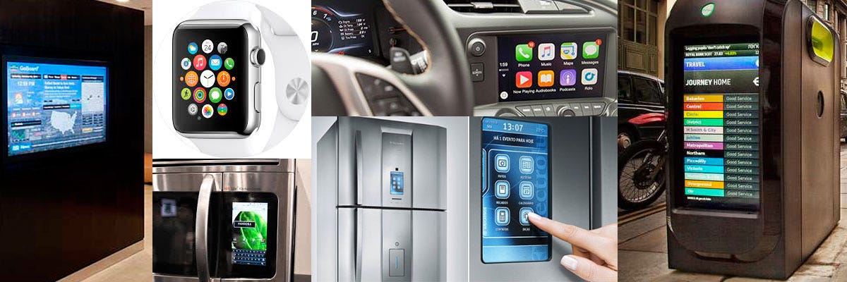
And I believe a technological tiller is sticking an iPad screen over every new Internet-of-Things things. What if good design is about avoiding the screen altogether?
Learning about technological tiller teaches us that sticking too much to old perspectives and ideas is a surefire way to fail. The new startups developing invisible and conversational apps understand this. They understand that the UI is not the product itself, but only a scaffolding allowing us to access the product. And if avoiding that scaffolding can lead to a better experience, then it definitively should be.
A Future of Designers Without Jobs?
So do I believe that AI is taking over, that UI are obsolete and that all visual designers will be out of jobs soon?
Not really. As far as I know, UI will still be needed for computer output. For the foreseeable future, people will still use the screens to read, watch videos, visualize data, and so on. Furthermore, as Nir mentioned in his great article on the subject, conversational apps are currently good at only a specific set of tasks. It is safe to think that this will also be the case for new technologies such as Emotiv and project Soli. As game-changing as these are, they will most likely not be good at everything, and UI will probably outperform them at specific tasks.
What I do believe, however, is that these new technologies are going to fundamentally change how we approach design. This is necessary to understand for those planning to have a career in tech. In a future where computer can see, talk and listen and reply to you, what good are going to be your awesome pixel-perfect Sketch skills?
Let this be a fair warning against complacency. As UI designers, we have a tendency to presume a UI is the solution to every new design problems. If anything, the AI revolution will force us to reset our presumption on what it means to design for interaction. It will push us to leave our comfort zone and look at the bigger picture, bringing our focus on the design of the experience rather than the actual screen. And that is an exciting future for designers.
💚 Please hit recommend if you enjoyed or learned from this text.
To keep things concise, this text uses the term UI as short for Graphical User Interface. More precisely, it refers to the web and app visual patterns that have become so pervasive in the recent years.
This text was originally published on TechCrunch on 11/11/2015.

Published in #SWLH (Startups, Wanderlust, and Life Hacking)


