Ind.ie Labs - Blog - Applying Flexbox to the Video Player
Save article ToRead Archive Delete · Log in Log out
8 min read · View original · ind.ie
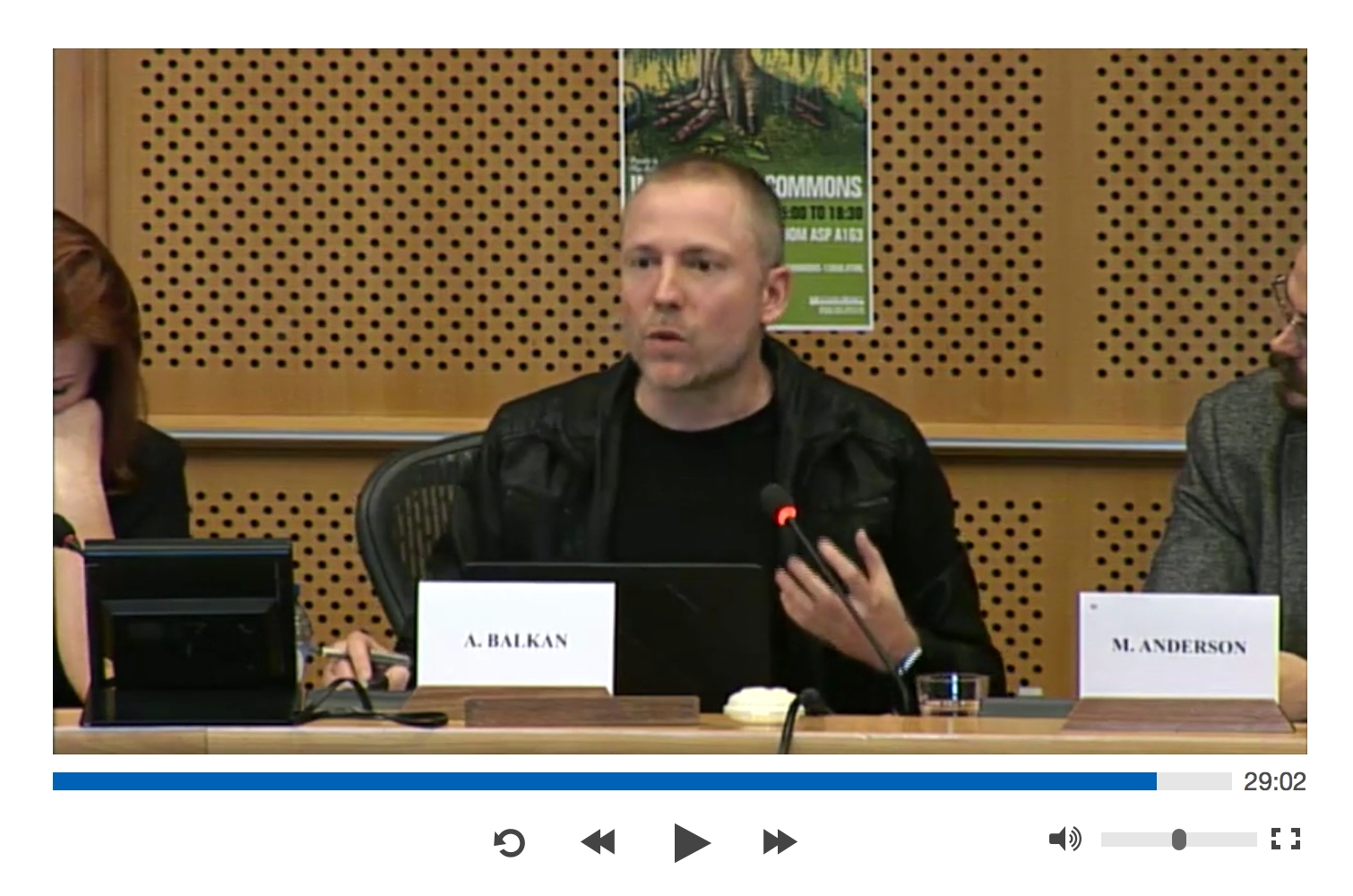
When I added the Internet as a Commons video to the Ind.ie site, our video player had a problem:
The Problem: Inflexibility
“@indie the time display doesn't display the hours on the video embed. #bugreport” — Jelle Verkleij
The containing space for the time on the video player was only wide enough to display mm:ss, and not hh:mm:ss. This meant a video that’s playing at 1:29:02, will only appear to be playing at 29:02.
The layout of the video player uses floats to keep all the buttons in place whilst it resizes to fit the viewport (so it’s responsive).
I designed the CSS so it also shows the buttons exactly in the same order as the HTML source, so when you’re using keyboard navigation, you can move between buttons and the highlighted buttons are exactly as you expect them to be.
However, in order to make this work responsively, with all the elements shifting to fit the viewport space, I’ve used ugly CSS for the progress bar:
.progress-bar {
  width: 85%;
}
@media only screen and (min-width: 480px) {
  .progress-bar {
    width: 90%;
  }
}
@media only screen and (min-width: 480px) {
  .progress-bar {
    width: 92.5%;
  }
}
@media only screen and (min-width: 970px) {
  .progress-bar {
    width: 95%;
  }
}
@media only screen and (min-width: 1795px) {
  .progress-bar {
    width: 97.5%;
  }
}
The width of the progress bar is arbitrary and eye-balled so that the time and progress bar roughly fill the space below the video in different viewport sizes. It’s a lack of flexibility masquerading as flexibility.
For a long time, I wanted to make the video player properly flexible. This bug finally gave me the kick I needed. Enter: flexbox.
The Solution: Flexbox
Flexbox is a CSS layout module aimed at laying out flexible components. If you look at the cross-browser support for flexbox, it initially looks good. But then you look at the known issues, and see a whole lot of caveats.
Progressively enhancing with Modernizr
Still… caveats never stopped me working with new standards, as I’m armed with Modernizr. Modernizr is a wonderful little script that detects support of browser features.
By default, the video player’s CSS works well with more old-school browsers, so it’ll be left as-is for those browsers (with a few tweaks to make the time space wider.)
Modernizr can generate a production-ready (small and quick) script that only detects flexbox and flexwrap support. (The Ind.ie site already uses Modernizr flexbox detection, along with detection for SVG, CSS Shapes, and CSS columns.)
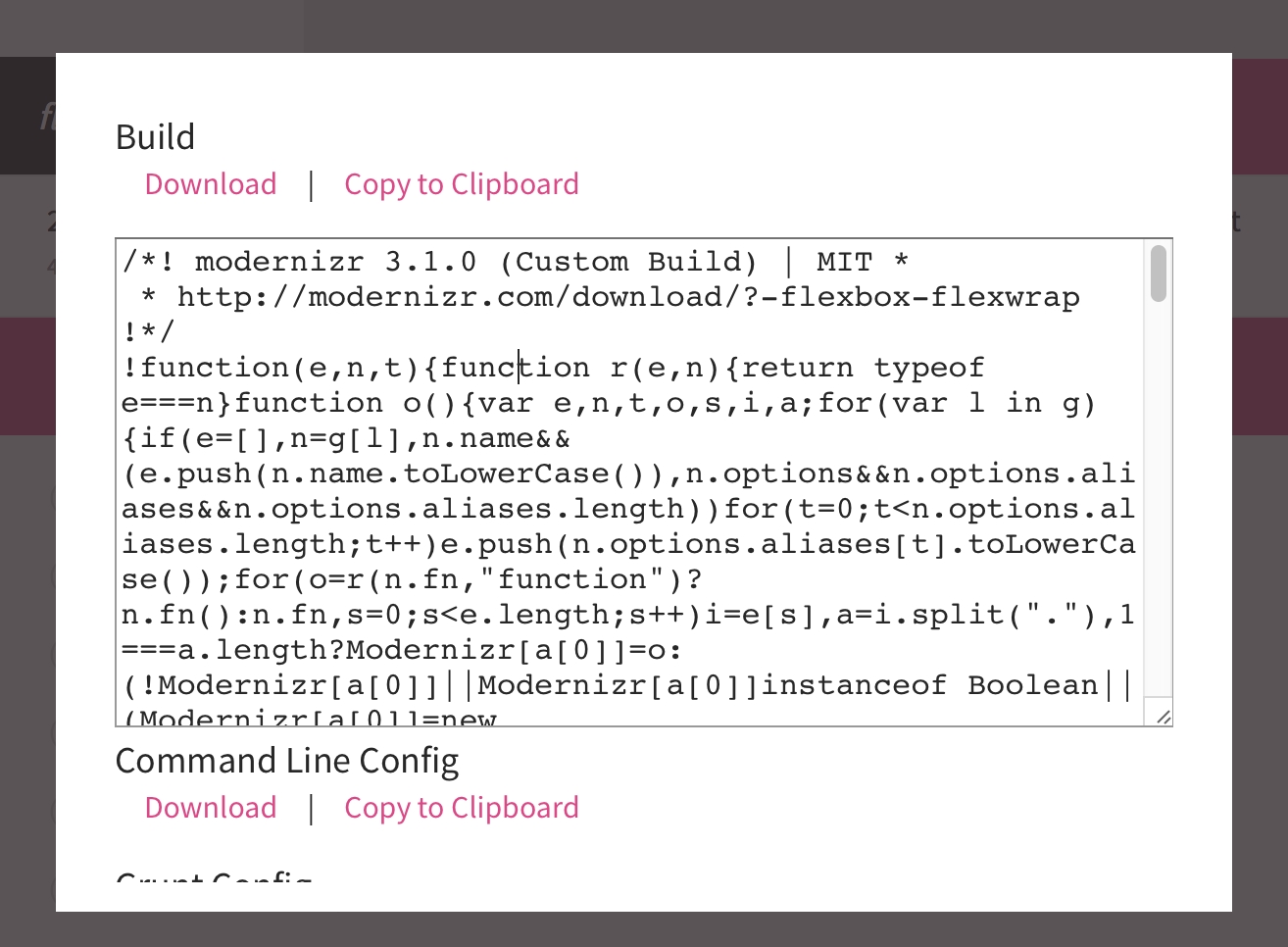
Modernizr detects feature support, then adds the supported features as body class names. This makes it easy to progressively enhance CSS as I can add fancy new CSS based on these body classes.
How the body element looks with Modernizr:
<body class="flexbox flexwrap">
This means I can specify CSS for all browsers, and CSS just for those that support flexbox and flexwrap:
.px-video {
    /* do all these things in supported in all browsers */
}

.flexbox.flexwrap .px-video {
    /* do things that are only visible to browsers that support flexbox and flexwrap */
}
Resetting the layout
Once it’s established that the browser has good-enough flexbox support, I can use flexbox without worrying.

Using the .flexbox.flexwrap class, I can reset the existing layouts so the existing percentage widths CSS don’t play havoc with the flexbox CSS. This involves removing any widths that aren’t button-specific, resetting margins, and any absolute positioning.
Floats and clears don’t have any effect on flex items, so there’s no need to reset those.
This isn’t very exciting (or pretty) CSS, but you get the idea:
.flexbox.flexwrap .progress-bar {
    width: auto;
}

@media only screen and (min-width: 480px) {
    .flexbox.flexwrap .progress-bar {
        width: auto;
    }
}

@media only screen and (min-width: 970px) {
    .flexbox.flexwrap .progress-bar {
        width: auto;
    }
}

@media only screen and (min-width: 1795px) {
    .flexbox.flexwrap .progress-bar {
        width: auto;
    }
}

.flexbox.flexwrap .px-video-progress {
    width: auto;
}

.flexbox.flexwrap .px-video-time {
    margin-top: 0;
}

.flexbox.flexwrap .px-video-playback-buttons {
    min-width: auto;
}

@media only screen and (min-width: 620px) {
    .flexbox.flexwrap .px-video-playback-buttons {
        left: auto;
        margin-left: auto;
        min-width: auto;
        position: relative;
        width: auto;
    }
}

.flexbox.flexwrap .px-video-controls button {
    margin: 0;
}

.flexbox.flexwrap .px-video-volume-controls {
    min-width: auto;
}

@media only screen and (min-width: 540px) {
    .flexbox.flexwrap .px-video-volume-controls {
        margin-top: 0;
    }
}

Getting started with Flexbox
Flex container
Flexbox can control the containing element (the flex container) and the individual items inside that container (the flex items).
To give the container its flex properties:
.flexbox.flexwrap .px-video-controls {
    /* enables flex for all its children */
    display: flex;

    /* arrange buttons/inputs in rows, not columns */
    flex-direction: row;

    /* run rows from left-to-right, wrap overflowing items to next row */
    flex-wrap: wrap;

    /* stick buttons/inputs to left/right edges with excess space distributed between */
    justify-content: space-between;

    /* horizontally centre rows inside container */
    align-items: center;

    /* horizontally centre all content inside container when there are multiple rows */
    align-content: center;
}


Flex items
Looking at the video controls, the ideal is for the time to take up all the space it needs (and no more), and the progress bar to fill the remaining space. The play control buttons should sit on the left side, and the volume on the right, both roughly filling half the space.
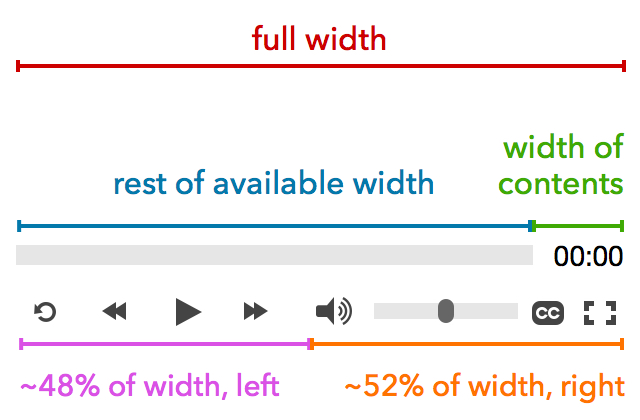
Setting the flex properties of the time
.px-video-time {
    flex-grow: 0; /* don't grow */
    flex-shrink: 0; /* don't shrink */
    padding-left: 10px; /* some padding for breathing space */
}

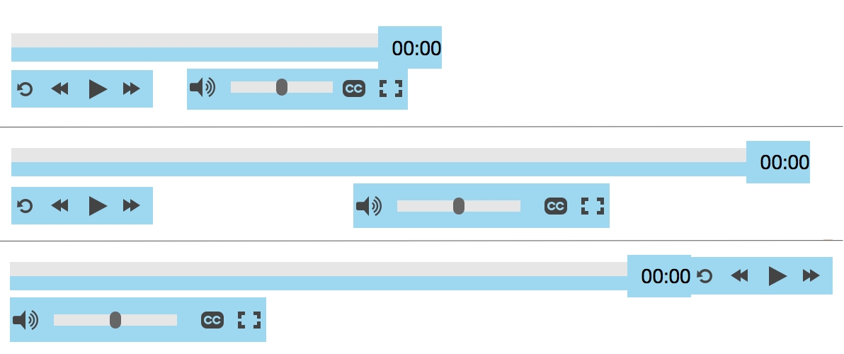
In order to get the progress bar to fill the remaining space on the top row, the bar needs to be wide enough that there won’t be room for the other buttons to jump to that row.
Then the magic part is specifying flex-grow: 1…
.flexbox.flexwrap .progress-bar {
    flex-grow: 1; /* flex to fill the rest of the available space */
    width: 75%; /* leaves enough space for the time */
}
.flexbox.flexwrap .progress-bar {
    flex-grow: 1; /* flex to fill the rest of the available space */
    width: 75%; /* leaves enough space for the time */
}

@media only screen and (min-width: 590px) {
    .flexbox.flexwrap .progress-bar {
        width: 85%;
    }
}


Next the volume controls need to be stuck to the right side, as they’re not flexing to the edges on all viewport sizes. This requires the playback buttons to flex-grow to fill the rest of the space:
.flexbox.flexwrap .px-video-playback-buttons {
    flex-grow: 1; /* flex to fill rest of available space */
    min-width: auto;

}

Flexboxception
The only layout issue that remains is centring the playback buttons on wider viewports. Ideally play/pause is exactly centre so it’s easier to hit. Here’s where flexbox can be used inside flexbox.

First the playback buttons container needs to be made into a flex container:
@media only screen and (min-width: 620px) {
    .flexbox.flexwrap .px-video-playback-buttons {
            /* enables flex for all its children */
            display: flex;

            /* arrange buttons/inputs in rows, not columns */
            flex-direction: row;

            /* run rows from left-to-right, wrap overflowing items to next row */
            flex-wrap: wrap;

            /* stick buttons to centre with excess space distributed on either side */
            justify-content: center;

            /* horizontally centre rows inside container */
            align-items: center;

            /* horizontally centre all content inside container when there are multiple rows */
            align-content: center;
  }
}

To offset the width of the volume and fullscreen buttons, the same width as the left padding needs to be added to the playback buttons:
@media only screen and (min-width: 620px) {
    .flexbox.flexwrap .px-video-playback-buttons {
        display: flex;
        flex-direction: row;
        flex-wrap: no-wrap;
        justify-content: center;
        align-items: center;
        align-content: center;
        padding-left: 180px;
  }
}

Just a quick margin tweak to align the progress bar to the vertical centre of the time… and it’s looking flexy in loads of viewports with minimal media queries required.
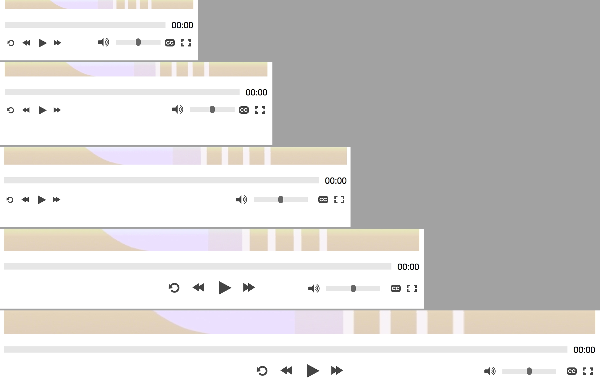
Conclusion
The flex-grow and flex-shrink proportions are the hardest part of flexbox, but with just a few rules you can easily make a component way more flexible than using percentage sizes and media queries. Thanks to the great CSS Tricks Flexbox guide for illuminating a lot of the harder concepts.