How to use code as your primary design tool — Design, Code and Prototyping
Save article ToRead Archive Delete · Log in Log out
12 min read · View original · stories.uplabs.com
How to use code as your primary design tool
“Design in Code” — a chat with Chris Gannon
When crafting a User Interface, there is — what feels like — an infinite number of constraints you have to work with, one of them being “is it doable?”. We started a series with MaterialUp exploring just that, the intersection between code and design, where front-end developers take up the challenge of coding a developer’s concept: “Can You Code This UI Concept?”, Vol 2, and Vol 3!
Today we’d like to introduce you to Chris Gannon, an immensely talented interaction and motion designer from the UK who straight out “designs in code”. You’ll quickly see the unique character in his craft — check out the visuals and make sure to play around with the Pens below!
More than that, find out about the beauty of “designing in code”.
Hi Chris! You’re a leader in animated SVGs. And you call your craft “Designing in Code” — can you describe what it means?
The beauty of SVG is that it’s all code — yes a complex SVG image is a LOT of code but it’s still just letters and numbers that can be altered in the browser very easily.
This means it’s a brilliant language to design with because I can create visual elements like circles, rectangles and lines just by writing a line of code; I don’t need to keep going back to a vector art app to create assets. For more complex shapes (paths, polygons) I jump into Adobe Illustrator (AI) and draw what I need but the fine tuning is done in the browser and to me, the fine tuning, the details, are what make something really shine.
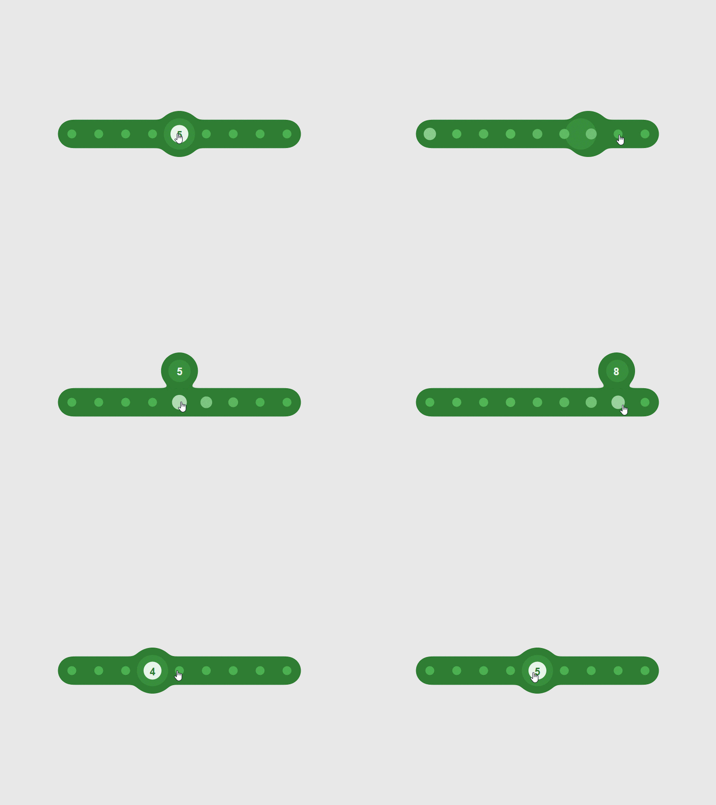
Here’s a shiny example ¬ Pod Slider

Click around ↓
Have you always designed in code?
I haven’t always designed in code — I’ve always drawn graphics, historically in Flash and now in AI and then animated the individual elements so designing in code is a fairly recent development for me.
Lots and lots of practise has allowed me to get my skill level up enough so that I don’t have to worry so much about the technicalities (although I still trip up). This means I can concentrate on visualising what I want and write the code in a text editor or directly in the browser to create something that (hopefully) looks graphically pleasing.
What are the advantages?
As far as advantages go I’d say the immediacy of SVG and the fact it’s rendered in the browser are two big ones. Couple that with CodePen’s instant previewing and GreenSock powering the whole thing and you can iterate over and fine tune ideas really quickly. Changing the code and seeing the result immediately means you get to where you want to be far quicker; it also means you can try and subsequently dismiss a bad idea quickly too.
Other advantages are that I can create very complex animations that I could never have drawn (or even visualised) — designing in code really gives me the freedom to play around and do impossible things and I love this freedom.
¬ Interactive Info Graph


So, what’s your design process?
When I first have an idea for a project I always sketch on paper. Sometimes but not often it’s a full blown storyboard (albeit badly drawn) and sometimes it’s nothing more than a few rough circles, lines and arrows that only I can understand — if anyone else looked at it they wouldn’t have a clue what it was but I usually need to get that initial idea down on paper to make it a real live ‘thing’.
Once it’s on paper it’s often immediately apparent that the idea just won’t work or won’t look the way I want. And sketching isn’t just useful to try things out — I also use it as a reference or reminder. It’s easy to disappear down a digital rabbit hole trying stuff out in code and going off on tangents when you’re designing something (which isn’t a bad thing!) so having a sketch of the initial idea is a good way to stay focused and keep the process on track. I find I execute my best ideas very quickly when the idea is clear and well formed; this is when the creative process flows and I disappear into the zone. If I’m having to force things to work and spending hours and days on one little part then I’ll probably bail out. I get bored VERY easily so I have hundreds of unfinished projects laying around!
As far as tools goes I try to use as few as possible. Becoming too dependent on proprietary software has bitten me on more than one occasion (Flash, Edge Animate) but it’s not always possible to be completely independent of software.
My SVG workflow is:
Paper -> AI -> SublimeText -> Browser (CodePen/GreenSock)
Just to expand on that and to acknowledge that by using AI I just contradicted myself about dependencies, I sketch on paper, rough it out in AI, copy it into a text editor (currently SublimeText which I use to tidy up, reorder and rename SVG graphics but any text editor is fine), copy that into the browser (CodePen specifically) and animate everything with GreenSock (yes, yes another dependency but a damn fine one!).
I can create everything I need with these but if they all disappeared tomorrow I could still create SVG animations although it would be MUCH more difficult and they wouldn’t look or perform nearly as well. And I would probably quit and become a bus driver.
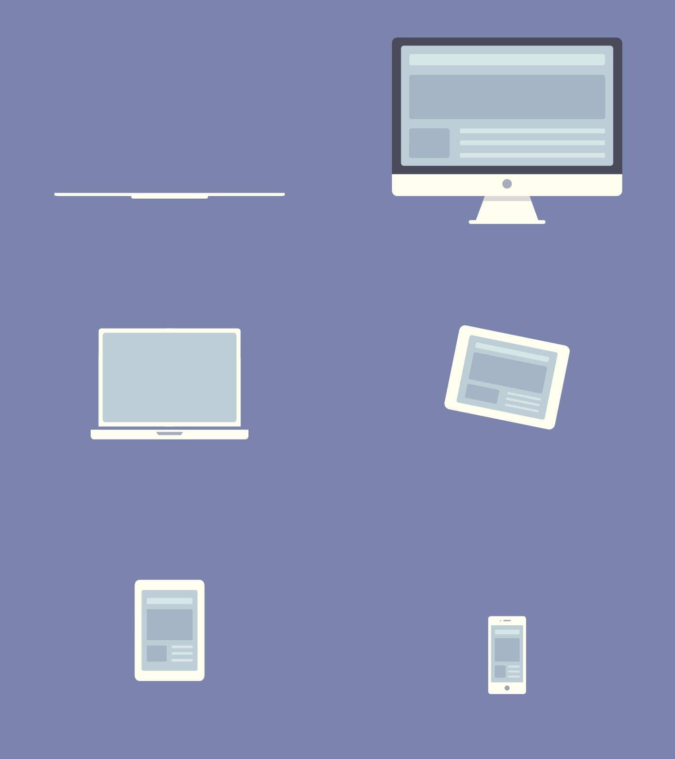
¬ All Devices

Is it fundamentally different than designing in Photoshop or Sketch?
I don’t design in Sketch, partly because I work on a PC and it’s not available and I don’t use Photoshop either because Illustrator is better suited for me. Designing in a graphics app will only take me so far, so usually I draw out a few things to get a sense of layout and colours and then pretty quickly hop over to SublimeText and CodePen and get cracking. I save all my Illustrator project files and if you compared the final animation’s look and feel to what’s in the AI file they hardly resemble each other at all.
Do you create them all to be used in live apps?
My aim has always been to build live projects. You may or may not notice that most of my animations have some kind of random element. It might be a star field or speed lines or particles. I love that fact that each time you look at the animation it will be a unique version however subtle. I used to be a video animator and I became frustrated with the ‘static’ nature of what I’d made. I’d render my work and even though every render was different because I’d included a random generator to create the piece, the version you use is the final version that you will see forever more. As an aside, I don’t have many pictures up in my house because I get bored of looking at the same thing over and over again!
And yes some of my work goes into client apps (web and native) and some of it is just for fun; it’s me just trying out an idea or practising a technique.
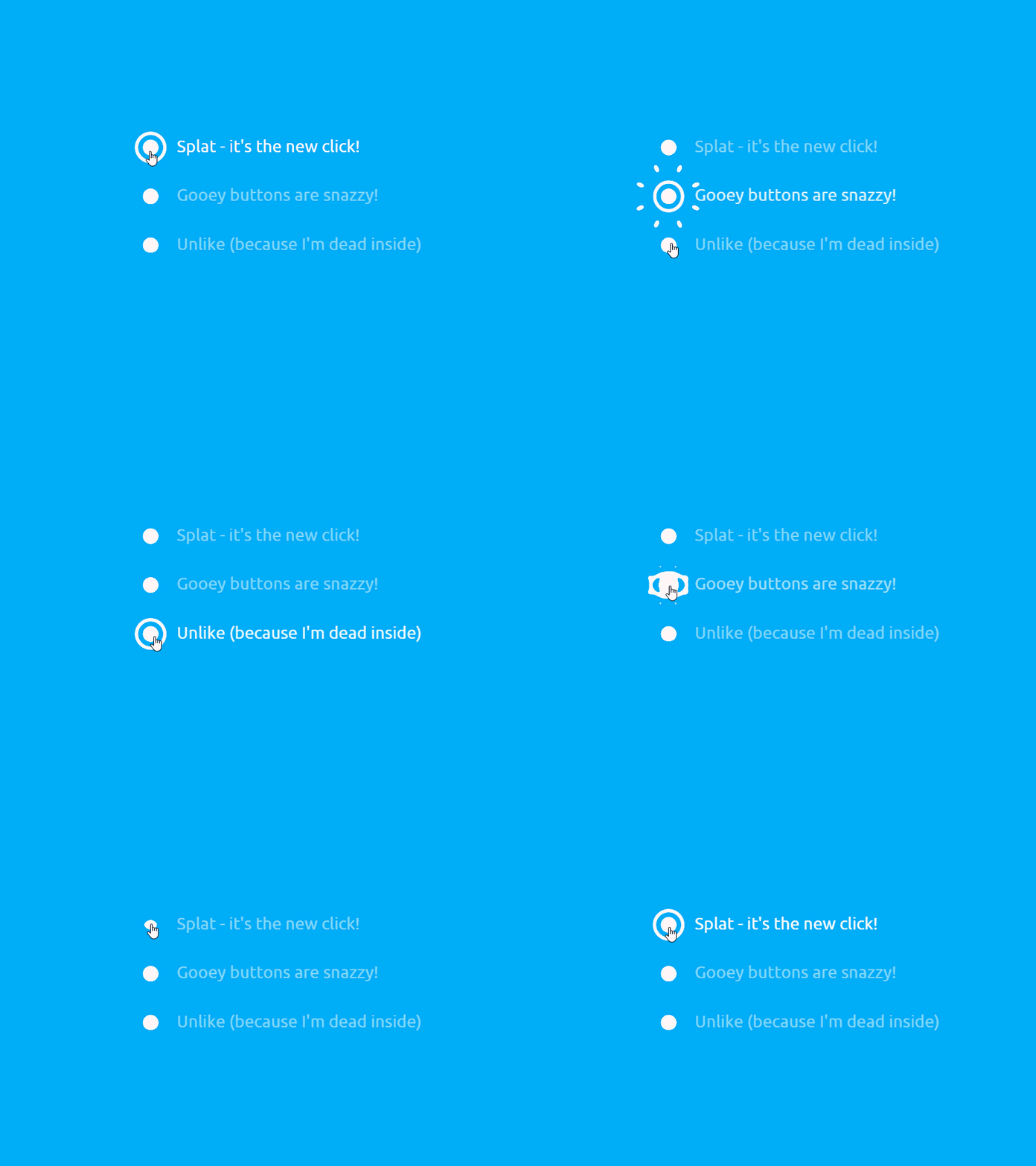
¬ Splat Radio Button

Can other people use them in apps?
Can people use them? People DO use them and often without my permission or the inclusion of the MIT license which is a bit of a bugbear for me. Don’t get me wrong, open source is great and works really well to a point. Unfortunately there are some who think that open source means free to use and make money with without correct attribution — a free code buffet. This annoys me a lot because I create work for a number of reasons, one of which is to pass on what I’ve learnt to others. If you want to fork my stuff, great. Learn from it, adapt it, customise it but don’t just blindly copy it and use it in your project. It’s lazy and disrespectful and makes me not want to share. I’ve been finding my work being used without my permission more and more recently (usually copied from CodePen) and often when I contact the person who used it they seem to genuinely not realise that a license must be included (or permission sought where appropriate).
That said the nice folks at CodePen have listened to these concerns (not just from me) and now the license is in a far more prominent place so hopefully this will make the situation better.
But I get it — we’re all magpies — we all steal and we all reuse and I’m no exception. But I tend to steal a concept or idea, alter it (and hopefully improve on it) and then incorporate it into something bigger so that the stolen idea is just one small part of a bigger piece. I would never just take an entire piece of work from someone else and pass it off as my own. I wouldn’t learn anything and so what would be the point in that?
¬ Download Dot Bounce (Success)

Is there one that you particularly liked creating?
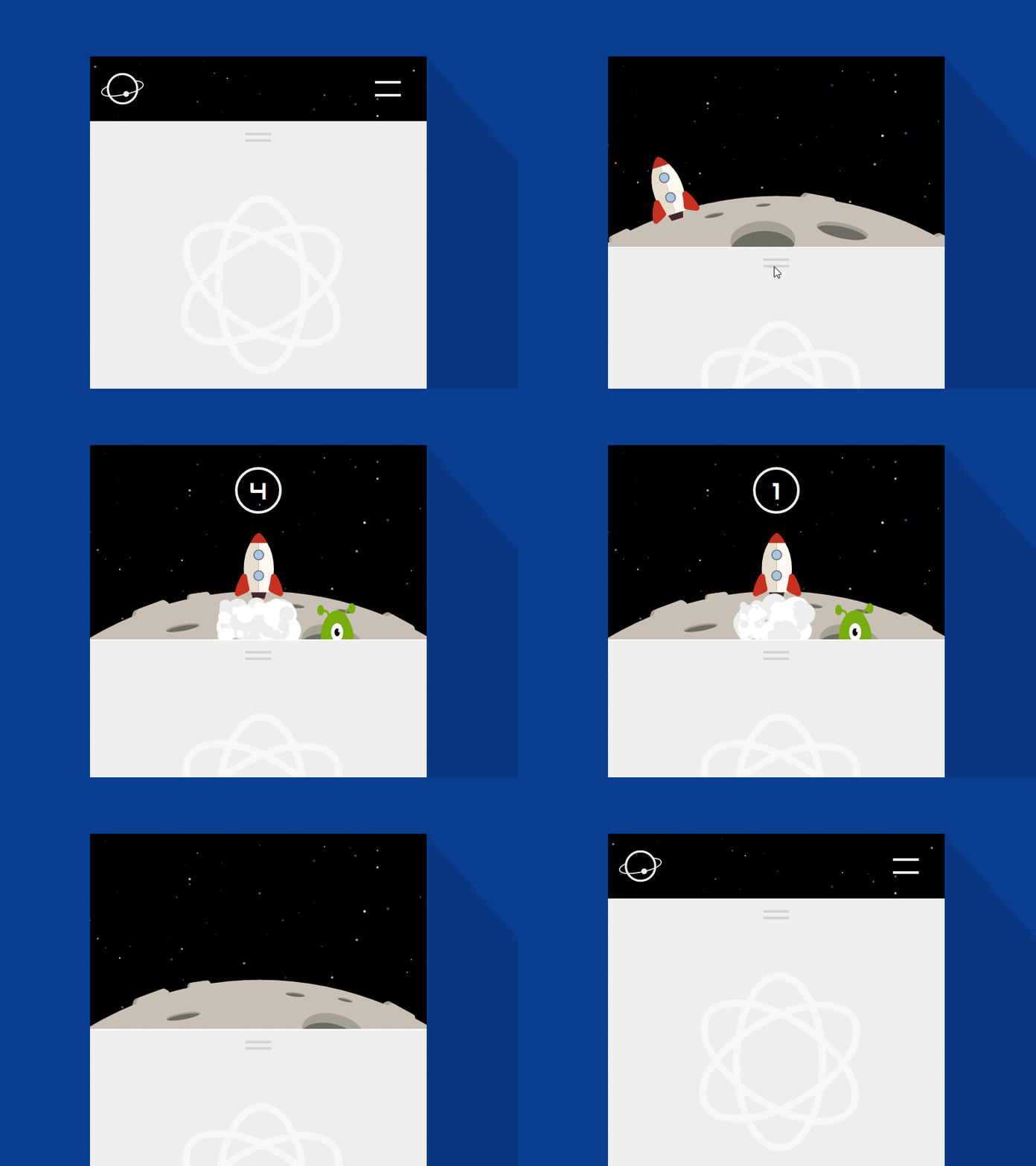
I love all of the stuff that I make (usually while I’m making it) and then usually within a few weeks (sometimes hours) I hate it and never want to see it again! But seriously the last thing I made is usually my favourite (which at time of press is Pull To Launch). It was really fun to make — I love the fact that the alien seems sad that the rocket is leaving. Making little stories or inferring an emotion in a tiny interactive space is really something I want to focus on more and more.
¬ Pull To Launch

If you pressed me to answer this I would say Balloon Slider is a favourite and also Interactive SVG Info Graph purely from an execution standpoint — both of these took a few hours to make (but then a few days on and off to fine tune).
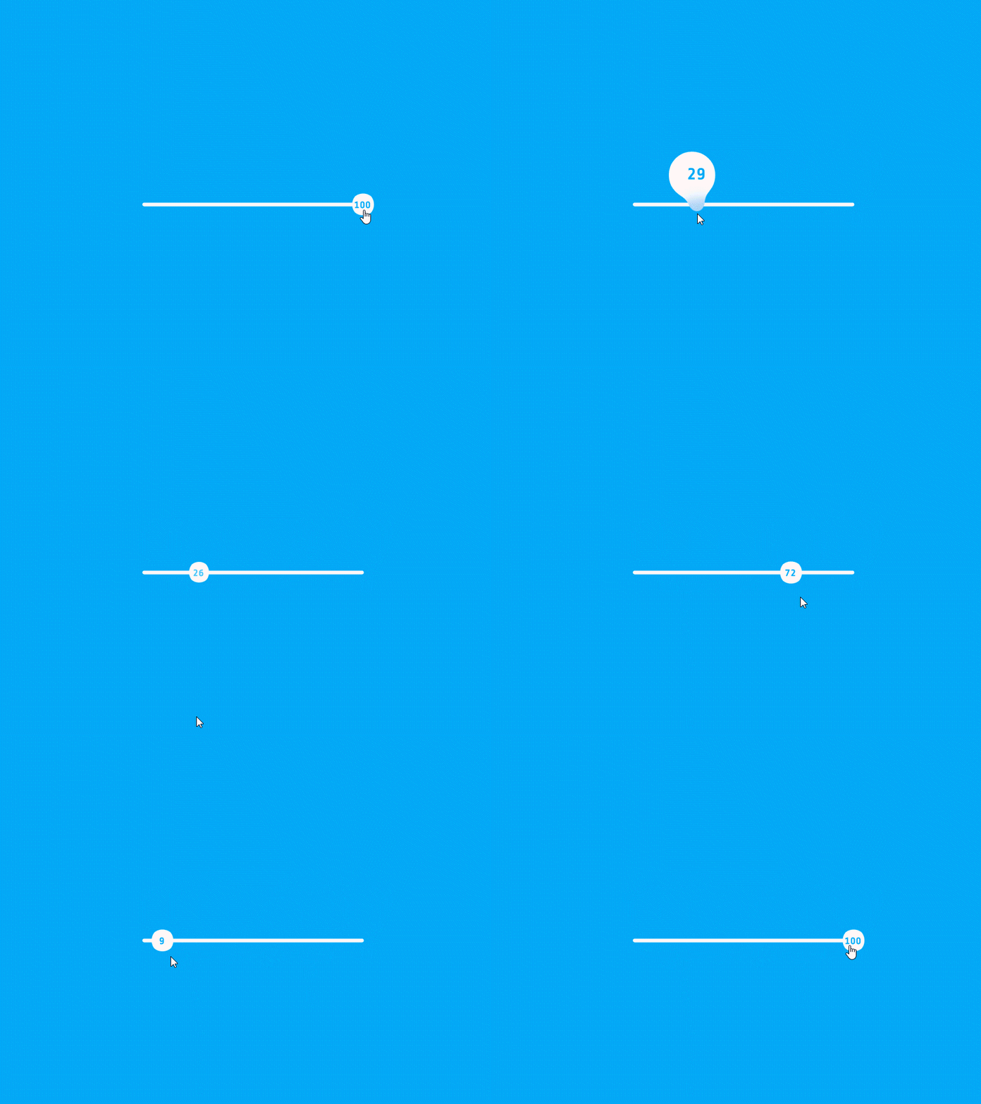

With both I had a clear vision of how they would work, how to make them and how they would be used; the creative process was smooth and I was properly in the zone. They also required the inclusion of several different techniques and disciplines — interaction, animation, filters, design, UI/UX feasibility and reusability all working in harmony. If a project requires lots of different skills I love to dig deep and push myself to make sure I deliver each part to the best of my ability. If I can add an element of storytelling too then that’s a bonus (however that wasn’t appropriate in these).
If I had to suggest a favourite that’s pure animation it would be CCTV — I really tried to add character to what are essentially some shapes; the cheeky ball (a circle) and the camera that likes to play by the rules (some boxes and lines). This was technically challenging not only to animate the various pivot points but also to make the movements and reactions seem ‘natural’. I think there is plenty of room for improvement on this though.
Will you create more guides like How To Make An SVG Lava Lamp?
I have a YouTube channel where I put out videos of tips and tricks on things I’ve learnt that can help others (usually involving GreenSock and SVG). Doing this also ensures I fully comprehend the subject matter — I can’t talk with any authority on anything unless I fully understand it so not only does it (hopefully) help others but it also cements a concept or technique in my head.
But these things take time. The lava lamp tutorial was a labour of love — I’d already finished the actual animation (which is also random!) and normally I’d want to move onto the next thing. But with that I had to go back and dissect what I’d done and present it in an easy-to-digest format. I’ll let others be the judge as to whether I succeeded!
The process of creating tutorials is challenging, educational and fun but it’s the positive reactions and giddy excitement I receive from readers who really learnt something new or who had a lightbulb moment because of something I wrote that really inspires me to make them so expect more in the future :)
¬ Kiosk Icon Menu

And here is Chris’ tutorial to “Create An Animated Radio Button Using GreenSock’s Cycle Feature”
More about Chris:

My name’s Chris Gannon and I’m a motion and interaction designer from the UK. I began my commercial career in animation in 1997 — I’d been running a record label and producing music for most of the ’90s situated in big studio space with lots of musicians, designers and artists.
One of the companies there asked me if I’d ever done animation before (I had, but very basic stuff on the Amiga and ZX Spectrum years earlier) because their client, which was the main UK telco, wanted to promote their outside broadcasting business. Flash was in its infancy then (still owned by Macromedia) so I picked it up and spent a huge amount of time creating four animations (which they loved and I loved making) so I quit the label and I’ve never looked back.
Find Chris on Uplabs, CodePen, Twitter and more:
