Designing your pages for conversion is a tricky job. It’s a constant fight of what works and what doesn’t. It’s a never ending process of testing, measuring and making changes.
One of the most difficult tasks I found in my work is to point your visitors right into your call to action in order to catch their attention and interest them in your offer.
While your copy is probably the most important part of this process, it’s still very important to support it with suitable design techniques that can put an emphasis on your message.
The good thing is that human behavior is mostly predictable and we can use it for our own advantage.
People love repeatable visual patterns. People will also quickly find any distractions from well defined pattern. We can use that knowledge to get their attention.
The question is, how can you lead your visitors right into your call to action in a subtle way without being too annoying and screaming with exclamation marks?
Every call-to-action wants some attention
Ok, before we dive into talking about the design of your website, let’s think about getting attention for a moment. Why do you even need to get someone’s attention and why is it so hard that you have to use some kinds of visual tricks?
The purpose of most websites is to attract the target audience and call them to action. The action can be an email sign up, social interaction or a product purchase.
Of course, the action you want people to take is usually not that attractive for first time visitors. You can’t just invite people to your website by saying “come and sign up for my email newsletter!” That wouldn’t convert well…
So, it is the content that attracts your target audience. It can be a good sales page copy, your blog posts, infographic, free ebook, you name it.
Once you have them in, that’s the time when you want to point them in a certain direction, the next level of your conversion funnel.
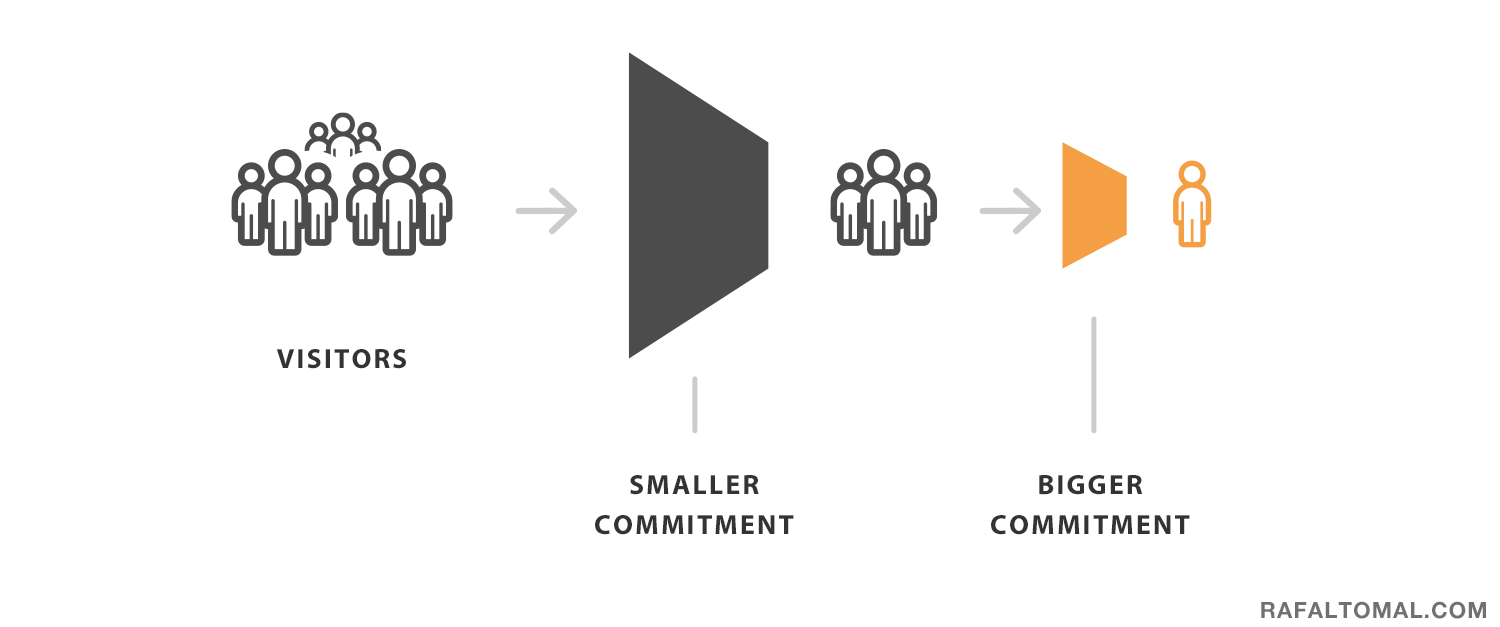
Now, getting someone’s attention and calling them to take the action is hard. The bigger the commitment to make, the harder to convert. Different types of actions may also require different approaches.
For example, asking people to sign up for your email newsletter in exchange for valuable free content is much easier than asking them to pay for something.
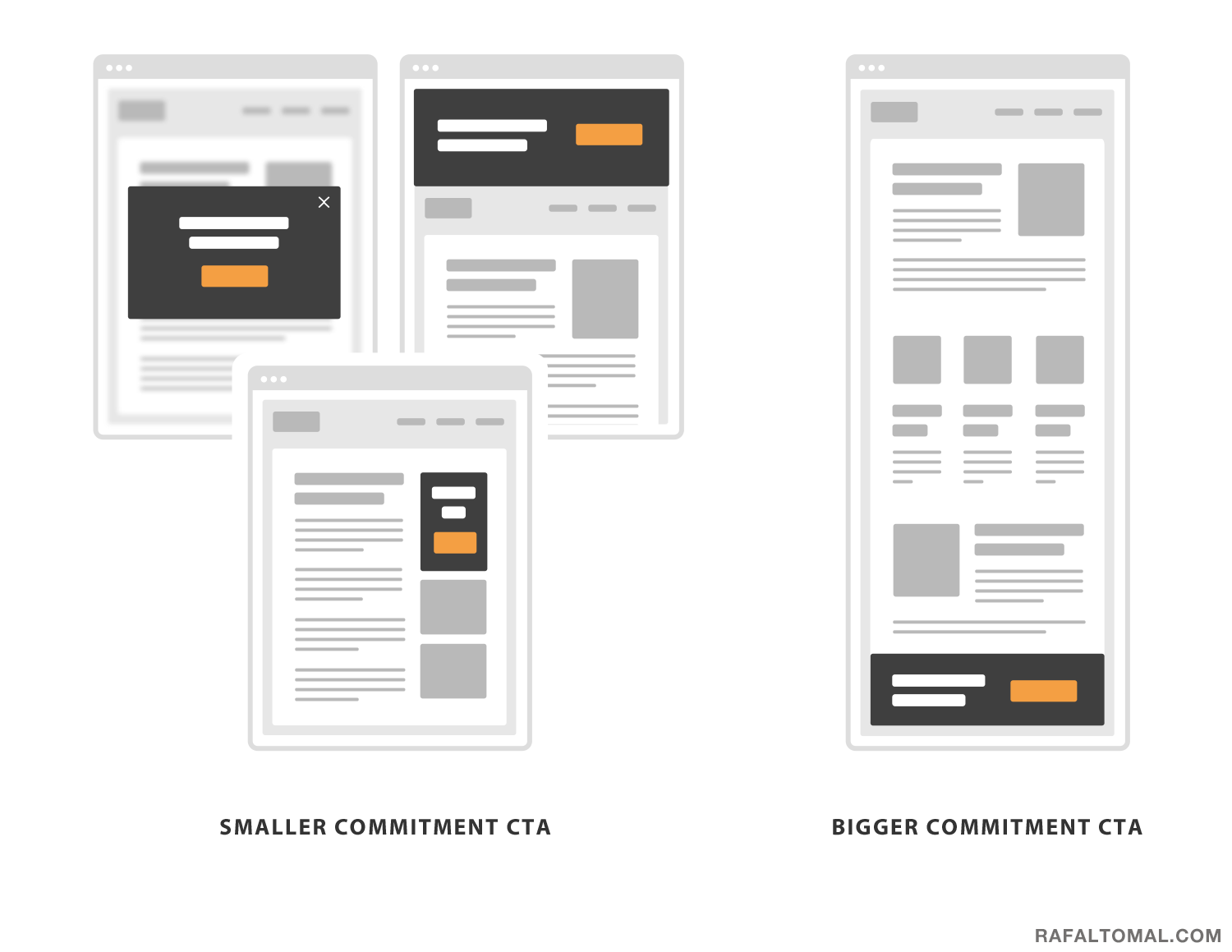
A call to action with a smaller commitment can be more direct. You can put it right in front of your visitors in the form of a popup or a big top banner.
However, the same approach wouldn’t work well if you used it for your buy button on a sales page. You want to prepare your visitors, educate them, resolve their concerns and build interest before asking them to purchase your product.
That’s why that call to action should be positioned more strategically. You need to be careful not to convert too early or your visitors may not be ready yet.
Define your visual patterns first
As I mentioned before, you can’t convince someone to take the action just by your design. It’s your copy that does all the heavy lifting, but you can help to emphasize the message and point some visitors right into it thanks to design.
And this brings us to the main point of this whole post, which is how to effectively break your visual patterns to get a visitor’s attention.
Your website visual identity is defined by typography, colors, layout and all the user interface elements. All of these combined create certain repeatable visual patterns.
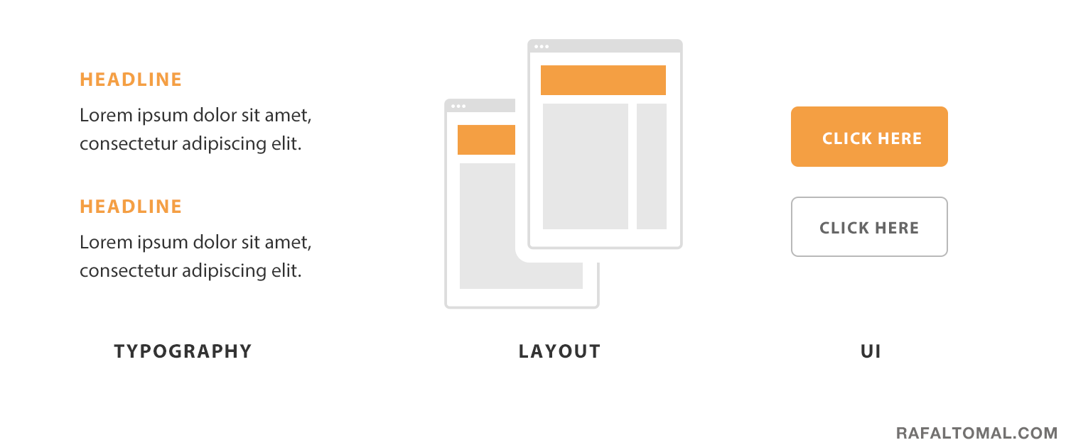
Try to make navigating and browsing your website predictable. You want to create a consistent and positive user experience in reading your content. That should be your base and foundation.
Now, consistency is the main point here. The more consistent your visual patterns are, the easier it’ll be to break it in a more subtle and elegant way.
And why would you want to break your beautiful design? To lead your visitor’s eye right into your offer on a busy page full of content. In other words, to get your visitor’s attention where you need it.
To explain better, imagine you’re invited to a party where everyone is dressed in whatever they want. So, you have all different colors and styles. It would be pretty hard to stand out from the crowd if you wanted someone to pay attention to you. It’s still possible, but you would need to take some ridiculous steps to do so.
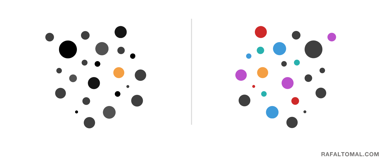
Now, imagine that you’re going to a party where everyone is dressed in black and white. What could you do to stand out from the crowd? It would be as easy as wearing a red t-shirt. People would notice you and you wouldn’t have to run around and scream.
As you can see in this analogy, it all makes sense only when there is a certain consistent theme applied as a base. Without it, when everything is different, nothing can clearly stand out.
Now, break your visual patterns
In your design, emphasizing your call to action can be easily achieved by using a contrast. I’m not talking about just color contrast, but a contrast in size, boldness, space or even position.
Some techniques work better for some people and may not even affect another group of visitors. So, the best idea is to combine at least a few of them.
For example, your call to action can be placed on a contrasting background and the title font set in bold. Additionally, you can add some extra space around it to make a bigger content/space contrast.
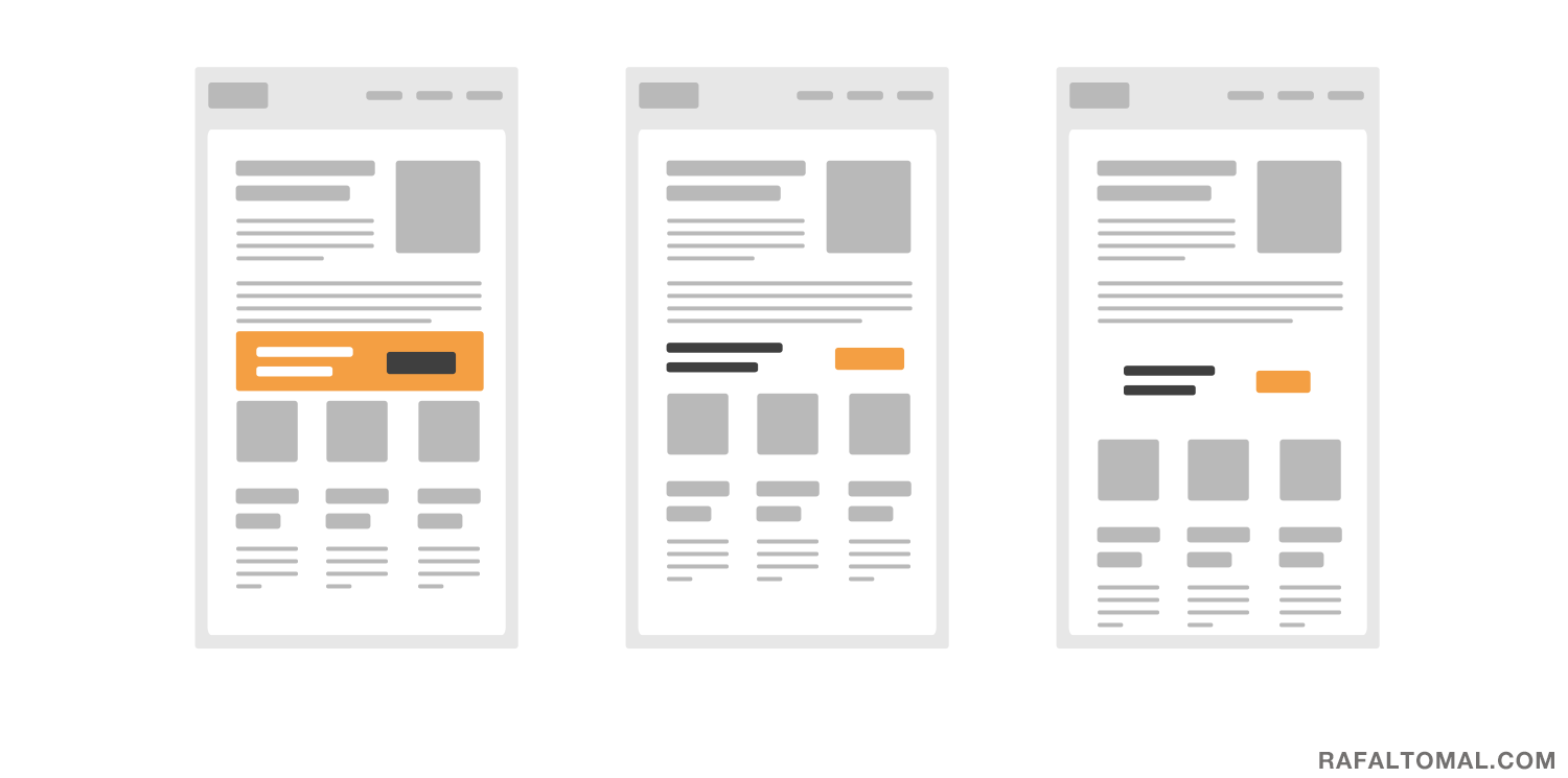
Using white space is a great way you can make something more prominent without adding more noise to your design. By simply creating more space around something, you separate it from the rest of the content. That separation and a clear layout break can quickly draw the user’s eye.
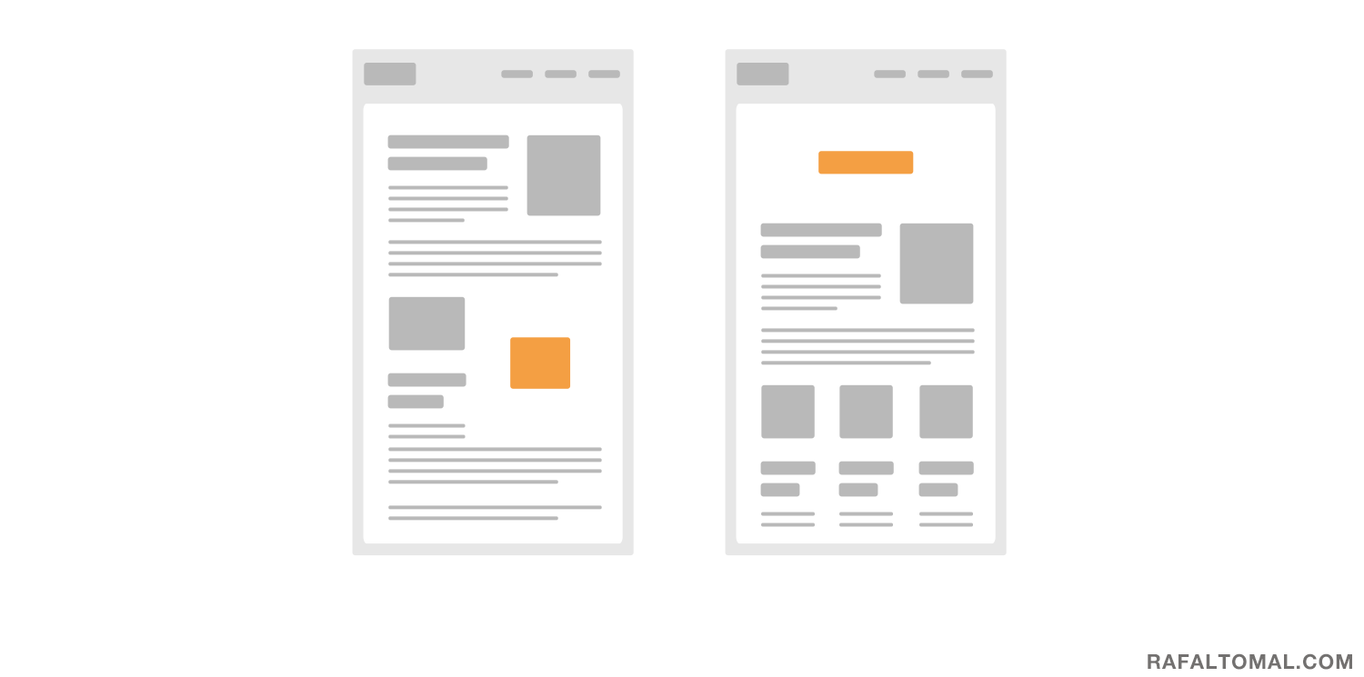
You can also break your grid if your design is set on a layout grid.
Layout grid is a common design tool used by web designers these days. It’s a good topic for a whole new post and I covered this concept deeper in my ebook, The Essential Web Design Handbook, if you’re interested in learning more about it.
For now, all you need to know is that a grid is nothing more than just an invisible web of vertical and horizontal lines that dictate your entire layout.
By placing all your content elements along those lines, you can create an organized and consistent design structure throughout the entire page. It helps to create a visual pattern in your website layout.
Now, breaking that grid will make your call to action stand out. It’s that simple. Just by positioning a certain element loose on the grid will put more emphasis on it.
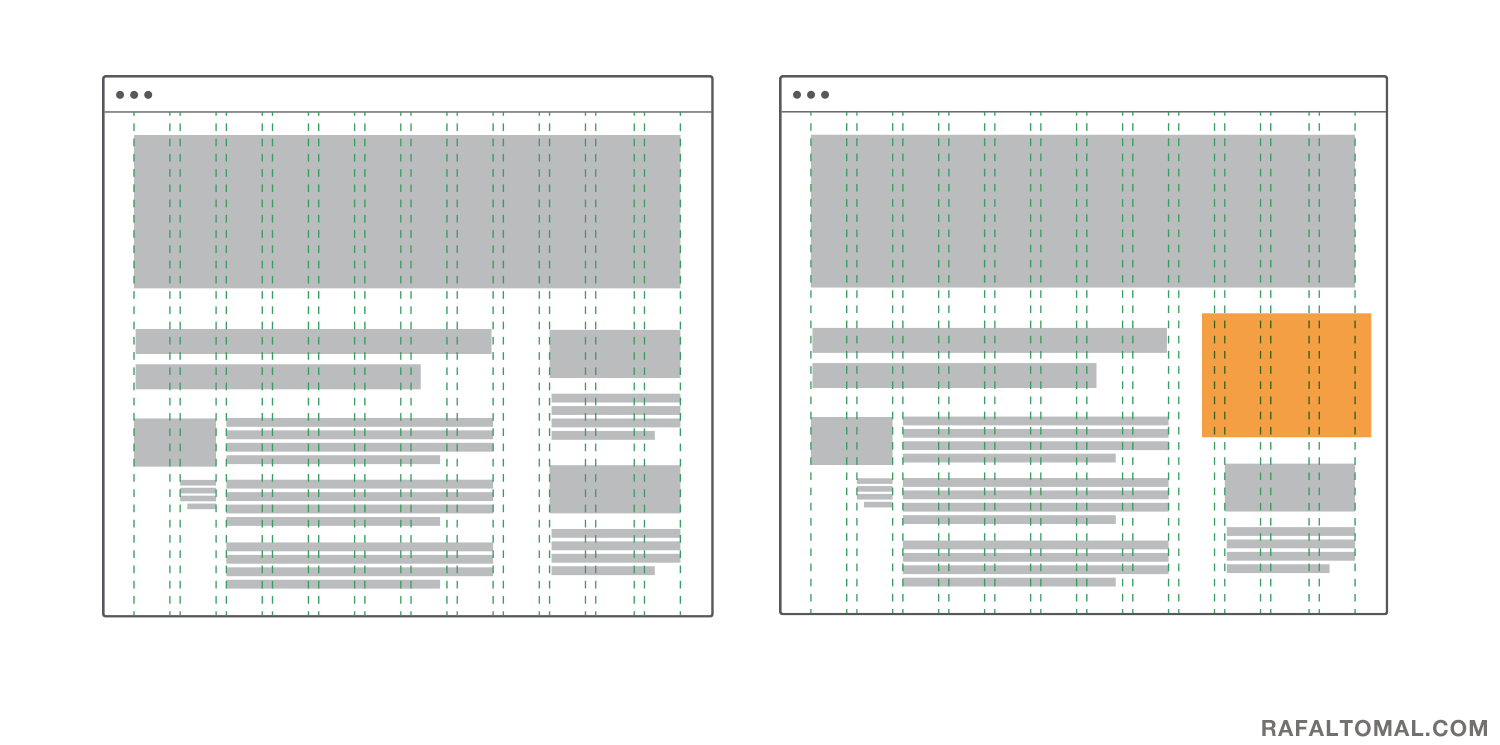
Our eyes love patterns and we follow them. Every human eye will catch such a distraction in a perfectly designed layout.
And that, my friends, is how you get your visitor’s attention.