Designers: Don’t make it too easy to mess up — Interactive Mind — Medium
Save article ToRead Archive Delete · Log in Log out
2 min read · View original · medium.com/interactive-mind


Designers: Don’t make it too easy to mess up
One thing Medium does better than WordPress
Your natural inclination as a designer is to ask yourself: What is the ONE THING my user is trying to do on this screen?, and design everything around that.
But answering this question can make things too easy to mess up.
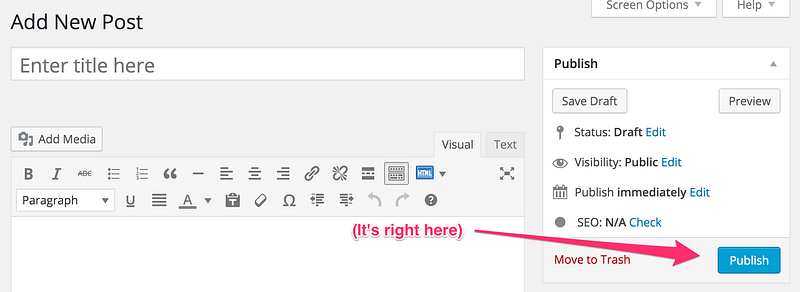
Take WordPress, for example. If you’re on the “New Post” screen, the ONE THING that your user is trying to do, you might say, is Publish a post. As a result, out of all things on the page, there is one button that stands out. Can you spot it?


This seems fine, until you accidentally hit this button, thus Publishing when you meant to Save Draft.
The reason being that you’ve just published a draft of your blog post.
Sure, you can un-publish the blog post, but it’s also impossible to truly un-publish your blog post. It’s already pinged a bunch of places, and shown up in RSS readers, and then those RSS readers were read by other services. Now your life is over.
This is the kind of nightmare that seems ridiculous if you haven’t experienced it yourself. But, you can see with a quick Google search that many people have run into it.
Like most things discussed on the Internet, there are delusional idiots, with no sense of how their own dumb brains work, who say you should simply be more careful, or that it’s somehow not WordPress’s fault when this mistake happens.
Take for example, this delusional idiot from the above thread:

Yes, it is an issue with WordPress itself. This is one of the most important jobs of a product designer: Don’t make it too easy to mess up.
Like it or not, your users aren’t always focusing 100% of their cognitive resources on interacting with your interface. They’re thinking about the structure of their blog post, they’re thinking about where they’re going to lunch, they’re thinking about how their asshole boss is always interrupting them while they’re writing blog posts.
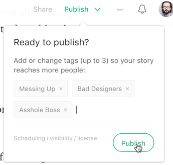
Here’s what it would look like if it were harder to mess up.
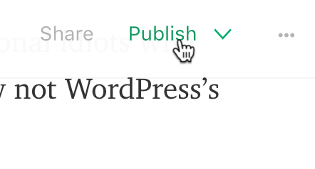
I’m confident it’s not going to instantly publish when I hit this button because of the little drop-down caret.


It’s even asking me “Ready to publish?” I can enter in tags, and when I hit Publish the second time, then it will really publish.


Not only is this harder to mess up, it’s nearly equally as easy to do right. Even if you make the error of thinking it will publish on the first click, you’ll certainly figure out that you need to click a second time.
If you still don’t get it, here’s one last example where a designer made it too easy to mess up.

Here’s a clip of Jason Fried on my podcast, explaining how to change software without alienating customers. If you like it, subscribe on iTunes.