Design Trends 2016: The Year of the Illustrator?
Save article ToRead Archive Delete · Log in Log out
6 min read · View original · sitepoint.com
Among the many 2016 design trend lists, I’ve been seeing three consistent predictions:
- the return of bright colors
- split-screen layouts, and
- the rise of illustration
Of course, using illustration in web design is no groundbreaking concept. In fact 2012, 2013 and 2014 all forecasted more illustration usage thanks to designers levelling up on their art skills.
Did we see it? Yes, to an extent, but this year is slated to be different with designers leaning towards a more authentic and diverse experience.
Illustration: The First Universal Language
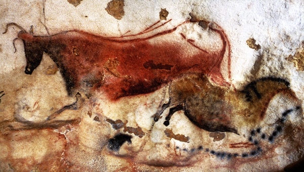
Illustration dates back long before the invention of writing. We are talking cave painting – Lascaux and Altamira to be precise. With at least 40,000 years of history, it seems clear that human beings – irrespective of culture or background – have a deep and abiding connection with the illustrated image.
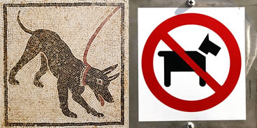
Dog related signage
While writing was often a tool for the elite, for most of history illustration has been the best method to communicate to what was a mostly illiterate population. Paintings, carvings, stained glass windows and mosaics served to record history, entertain and inform the masses about laws, dangers, morals, and other practices.
In fact, the way illustrations has been used since ancient times isn’t very different to the way they are used now even in modern design.
Recent Trends in Illustration
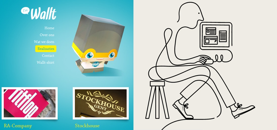
For the early part of this century we saw a lot of colorful artwork in the shape of icons and vibrant mascots. Heavily shaded, three-dimensional characters, and richly rendered forms were all the rage.
This year illustration is heading for a more authentic and organic experience. Low-color, hand-drawn looks that are specifically created for a single-site use are becoming more common and are expected to stay around for at least the remainder of the year.
Custom designs will more often take on a unique, loose, and even childish feel. Websites will feel more personable compared to the copy and paste looks we have been seeing thanks to the prevailing flat design/minimalism bandwagon.
The Big Picture
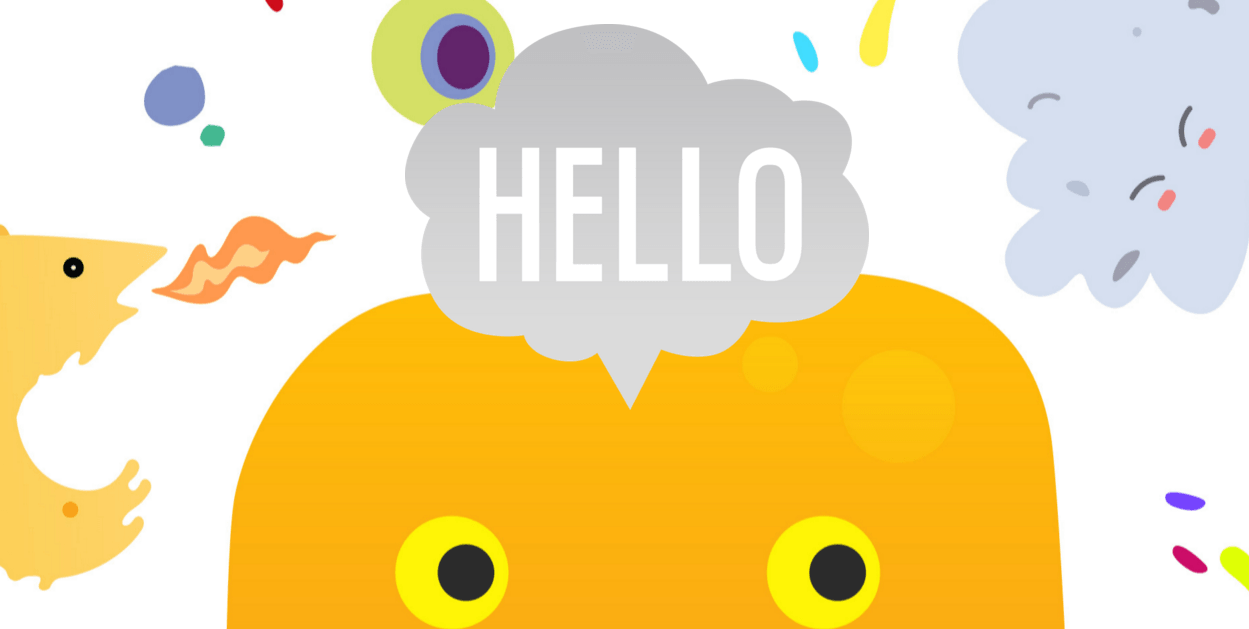
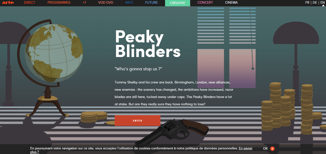
There are many places in your web design where you can employ illustration. To quickly engage your audience the hero-style illustration may be your best bet.
Large hero illustrations will suit some niches better than others. For example, a design agency or surf shop using the illustrated hero will typically work more readily than a law firm or government department. Then again, there are no set-in-stone rules.
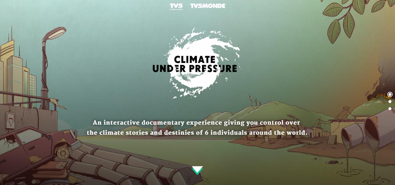
climateunderpressure.com
The great thing about the hero-style illustration is that you can include much more detail than you would if you were created something like icons.
Quick Tips:
-
DO go for relevance. Unrelated designs have no place in the hero section let alone your site.
-
DON’T forget the detail. You want to grab the visitor’s attention and impress them so don’t be afraid to put more effort into your look.
-
DO keep it clean. While details are good you need to keep an eye on how much you use to avoid clutter.
Be Iconic
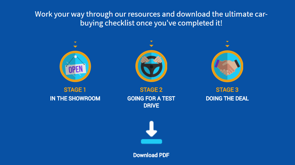
Sometimes finding the right place to use illustrations can be a challenge, especially if your site isn’t as rich or colorful. Luckily, if you want to add illustration it is as simple as looking at your icons.
Icons and similar UI elements are a great place to inject personality and energy into your site design though it’s important they gel with your existing elements. As DesignBundle shows, it’s possible to add small, simple, personality There are lots of styles you can go for and while ‘flat design’ is still in vogue, don’t be afraid to go for some textures and depth.
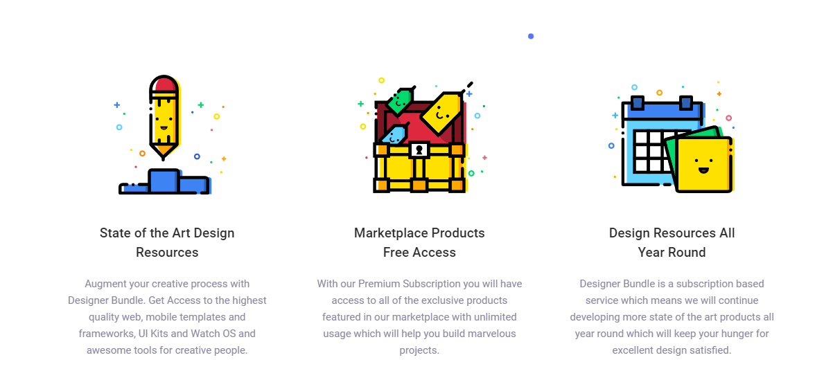
designerbundle.com
While you can and should customize your icons, don’t go overboard with it. This is not a time to sacrifice clarity of meaning for artistic expression.
Quick Tips:
-
DO customize. Don’t be afraid to think a little outside of the box when it comes to your icons, different is good.
-
DON’T go overboard. Icons shouldn’t rely on fine detail to be recognisable.
-
DO remain consistent. Though icons are a good place to try new things remember to build them around your site’s design.
Make it Move
The great thing about trends is that you can mix and match them at will and get some really eye-catching results. Tasteful animation and illustration can go hand in hand so it’s no surprise we’re seeing more websites incorporating this combo into their work.
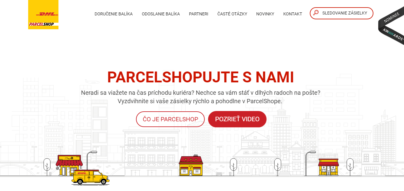
There are many areas where animated illustrations can be employed but the best place to apply them is with those interactive hand-drawn elements. DHL’s Slovakian site only needs 3 or 4 simple animations to add a touch of life to their site. They also delay the animation long enough to avoid distracting users who know where they are going.
Though, I must admit I do worry about those driverless DHL vans.
Of course, you need to keep this animation subtle and not over complicate things. If you haven’t dived into adding animation to your work yet, I suggest you check out my 4 Tips for Using Animation in Design.
Quick Tips:
-
DO use hover. Hover animations are always a welcome addition to sites, plus you’ll know immediately what’s interactive or not.
-
DON’T over-complicate it. Your illustrations should be animated in a purposeful way. Avoid animations that surpass 5 seconds for one cycle.
-
DO experiment. Don’t be afraid to try something beyond a garden-variety fade in or bouncing animation. Loops can be maddening like a dripping tap, so vary your timing on different elements to obscure their repetition.
Customize that Type
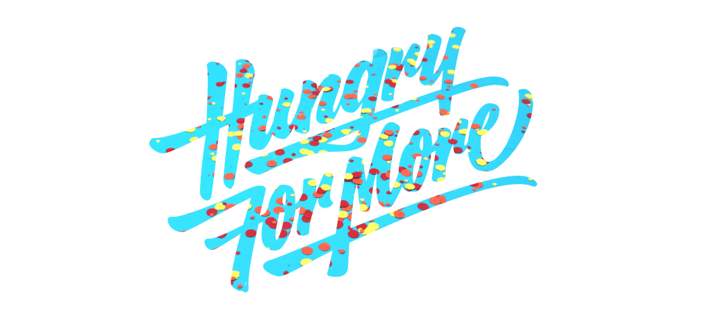
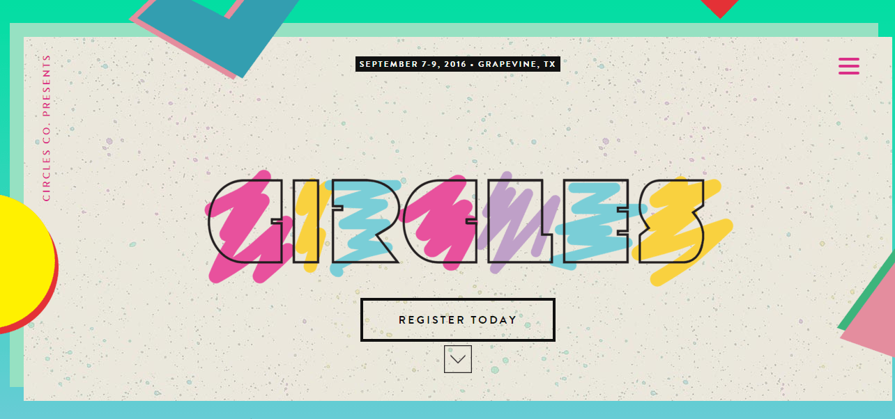
Bold typography is back in a big way this year, so as with animation, it only makes sense to blend this trend with illustration.
The great thing with large typography is that it can be used in lieu of images. The addition of a hand drawn look will make an already captivating type demand the attention that you want.
When you decide to illustrate your custom type remember that color, shape, and size does matter to your particular design. A hand-drawn pencil look might work better for a bohemian shop than a web source website. Keep things like this in mind.
Quick Tips:
-
DO your research. Before you try your hand at the hand-drawn typography you should look around at sites that use this technique and font resources like Dafont and Font Squirrel.
-
DON’T use multiple styles. Illustrated typography is a bold choice on its own so you want to avoid mixing and matching no matter how compelling it is, stick to one typeface – two at max.
-
DO get fancy. Don’t just leave your typography plain. Try gradients, outlines, and textures for a cool effect.
The Bottom Line
More from this author
Incorporating illustration into a design can sometimes be a ‘hard sell’ because it is more of an unknown. It’s simply easier for stakeholders (clients/managers) to imagine a standard photographic/text layout, so getting sign-off to begin work on a new illustration feels riskier for managers. It might take some hand-holding.
Nevertheless, as the examples above show, the opportunities to create a deeply original, distinctive look and feel are so good that it’s almost crazy to ignore them. Just follow the quick tips above and give it a shot.
What do you think about adding illustrations to your designs?
