CSS at BBC Sport (Part 1) — Medium
Save article ToRead Archive Delete · Log in Log out
18 min read · View original · medium.com/@shaunbent
CSS at BBC Sport (Part 1)
A few weeks ago I tweeted about BBC Sport’s CSS architecture and it got a lot of attention:
I promised I’d write a blog with more details so here goes. When I started writing this I realised there was lot to say so I’m going to split this two blog posts which covers how we’re approaching CSS at BBC Sport.
The BBC Sport website is the UK’s most popular sports website, providing coverage of around 50 different sports. From major sports such Football, Formula 1, Cricket and Rugby, to minor sports like as Archery, Bowls and Handball. On average we receive 26 million unique browsers a week. As is now common across the web, the number of users accessing BBC Sport from a mobile device has been steadily increasing of the last few years. We now on average receive more than 50% of traffic from mobile devices, with this percentage increasing at weekends as people are keeping up to date whilst out and about.
With this in mind prior to the 2014‘s big sporting events like the Sochi Winter Olympics, Glasgow Commonwealth Games and FIFA World Cup we began the responsive transformation of the BBC Sport website. This provided the opportunity to start again, to define a new architecture, avoiding mistakes made in the past and planning for what will come in the future.

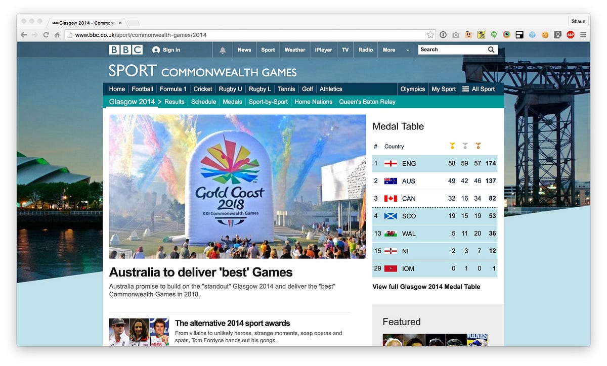
I joined the team in January 2014 at the beginning of this journey, specifically to focus on producing a responsive front end architecture which could scale to meet the demands of a website the size of BBC Sport.
A number of good architecture decisions had already been made like the decision to take a mobile first approach, follow BBC News’ Cuts the Mustard approach, use of BEM for class names and Sass as a our pre-processor of choice.
Whilst this was a solid foundation we have since introduced a number of other significant changes to a front end workflow which has ultimately led us to a place where we have a scalable architecture and a lightweight CSS footprint.
Core Architecture
The core CSS architecture of BBC Sport is based around three key tools:
The combination of these three tools, a long with a clear set of principles was worked really well for us.
Block, Element, Modifier, or as is more commonly known BEM, is now regularly found across the web. For me, and others, BEM has become second nature and just forms part of my front end development workflow.
How and why to use BEM has been covered several times before so I won’t go over that again here but the one of the main benefits BEM gives us is predictability. When working on a site the size of BBC Sport having the ability to make changes to our CSS and confidently know the effects them changes will have is invaluable to us. This, for us, along with the many other benefit of BEM, far outweighs any negative opinions people may have about the aesthetics of BEM.
Working with abstractions and following an Object-Oriented CSS approach has helped keep our CSS lean and our UI consistent. Identifying common repeating structural patterns and abstracting them into reusable CSS objects is now common practice at BBC Sport. Prior to the introduction of OOCSS developers would create components with large amounts of bespoke CSS, CSS that is often common in other components.


A great example of this is the first data module we created for our new responsive site, the Sochi 2014 Winter Olympics medals table.
The CSS for this table was created without a consideration for how it could be used for any of the other tables we feature across the site. This single table is constructed with 475 lines of Sass and weighs in at 16kb (3kb gzipped). We have since produced a single flexible table abstraction. This single abstraction now powers every table across the Sport site, from Rugby to Cricket and Formula One to American Football. We’ve even recreated the Winter Olympics medals table using this table abstraction. Our reusable table abstraction comprises of only 180 lines of Sass, weighing in at 2kb (0.6kb gzipped). With 8 times less CSS we have been able to create an abstraction which is flexible enough to power every variation of table we have across the site.
The final tool which forms our core architecture is ITCSS or Inverted Triangle CSS. Compared to BEM and OOCSS this one seems to be less well known yet its probably the tool thats had the biggest impact on our codebase.
ITCSS comes from CSS legend, Harry Roberts. If you’re not familiar with this approach to managing CSS I strongly urge you to watch Harry’s talk: Managing CSS Projects with ITCSS.
Harry came to work with us for a day back in 2014 where he shared the ideas behind ITCSS with us. We were one of the first people Harry had shared the ideas of ITCSS with and have been using it ever since. Following the ITCSS methodology has transformed the way we write, plan and organise our CSS.
As Harry explains:
A lot of methodologies try and avoid or ignore CSS’ ‘features’, ITCSS makes them work to our advantage
We have found that as we’re not spending our time trying to fight against the cascade, specificity or any of CSS’ other gotchas; if we’re not constantly unsetting or overriding CSS defined earlier on in the project; if any new piece of CSS has somewhere to live, we get efficient, reusable CSS which is a pleasure to work with.
We’ve been following this approach to writing our CSS for two years and one conclusion I’ve come too is that the best way to avoid CSS becoming a pain point of a project is to write as little of it as possible.
CSS Principles
To support our core CSS architecture we apply a number of principles writing CSS. Simple things like:
- Strictly no IDs in CSS
- Avoid unnecessary nesting
- Keep specificity as low as possible
- No magic numbers, all units must be derived from GEL units
- Keep scope limited to thing you’re styling
- Avoid unnecessary unsetting of styles
- Lots of comments to explain whats going on to other developers
Beyond these basic principles there are a number of other things we care about like:
Single Responsibility Principle
Wherever possible we try to make each class do one things and do it well. Be that an abstraction solving a common layout problem, a low level utility class which is one step away from an inline-style or a more complex component solving a specific problem, potentially encapsulating some semantics relating to a specific sport.
This approach does promote the heavy use of multiple classes in our markup, at first this approach did receive some resistance for other members of team, however overtime the benefits of using multiple classes has proven to be far more flexible and scalable.
By making each class perform a single specific task our codebase becomes decoupled with very few dependancies between parts of the codebase. It then becomes a matter of composing these reusable classes together to quickly create new components and features.
Following the single responsibility principle has not always been the easiest thing to achieve, I personally have often been tempted to try and combine a few things together to maybe reduce the number of classes used in our markup. However, in nearly every case this hasn’t worked and we’ve need to separate things back out.
Separation of Concerns
The Separation of Concerns deals with breaking our interface up into smaller chunks which can be composed together, ultimately resulting in more maintainable and predicable code.
In the early days of the new BBC Sport codebase this was not a principle we followed rigidly. We would often try to combine a few classes, each with different purposes together on a single element. For example, combining layout and component specific styles:
<div class="grid my-component">
    <div class="grid__item one-third--medium my-component__item">
        ...
    </div>
</div>
We found this kind of mixing of concerns led to bugs and un-predicable behaviour. So we now actively try to keep our concerns separate by introducing additional elements creating buffers between different types of styles. The above example would now look something like this:
<div class="my-component">
    <div class="grid">
        <div class="grid_item one-third--medium">
            <div class="my-component__item">
                ...
            </div>
        </div>
    </div>
</div>
Some may claim this is unnecessary HTML bloat, however the benefit this separation of concerns gives us far outweighs any negligible increase in the page weight. In nearly every case trying to remove elements and combine things can led to unexpected behaviour.
Immutability
As we make heavy use of abstractions and utility classes throughout our codebase we have to enforce immutability to avoid unintentionally breaking components.
We’ve started introducing namespaces to our classnames so its clear what each class does, where it lives in the ITCSS triangle and gives other developers, at a glance, more information and confidence when it comes to making changes.
.o- // Objects
.c- // Components
.u- // Utilities
.t- // Theming
We enforce immutability on our low-level utility classes by appending !important to every style rule. This gives us a number of benefits, firstly our utility classes become extremely predictable, we can always guarantee the outcome of applying a specific utility class. As we’ve purposely increased the specificity of our utility classes they can also not be overridden. Harry Roberts has recently written about “The Importance of !important”.
Developers from other teams in the BBC often have a shocked look on their face when I tell them we actively use the !important keyword in our CSS. We have over 700 !important`s in our CSS and it has not caused us a single problem in two years and only benefited us.
GEL Foundations
GEL or the Global Experience Language is the BBC’s shared design framework. The goal of GEL is to ensure experiences across the BBCs digital estate are both delightful and consistent.
GEL defines a consistent set of foundations which all BBC websites should be based upon. The GEL Foundations consists of a set of typographic styles, a collection of icons and a flexible responsive grid.
These foundations have traditionally been distributed as a set of PDF documents/guidelines which teams would implement within their projects. Working collaboratively with the GEL team of designers, the Sport engineering team have helped produce a set of reusable code implementations of these guidelines. GEL Designer, Al Jones, has recently written about this process in “Creating a GEL foundation for everyone”.
Typography

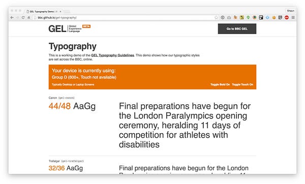
The GEL Typography guideline defines at set of 8 different type sizes and line-heights. Each size is given a name derived from traditional type measuring techniques dating back to as early as 1582.
This naming convention helps improve communications between disciplines. We’re no longer talking about 32px font-size and 36px line-height. We now talk about thats pica or thats trafalgar.
Each of these names maps to a typography class which can be used to apply the specific styling for that group:
.gel-canon { ... }
.gel-trafalgar { ... }
.gel-double-pica { ... }
.gel-great-primer { ... }
.gel-pica { ... }
.gel-long-primer { ... }
.gel-brevier { ... }
.gel-minion { ... }
With the exception of the navigation, typography is applied across the BBC Sport website exclusively using these classes. A clear separation of concerns. Working this way makes it extremely easy and quick to apply change to the typography. Its also great for working closely with UX. Designers can quickly open dev tools, change a typography and instantly see different typography styles applied.
Grid

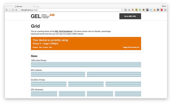
The GEL Grid guideline defines a flexible, responsive grid with a mix of fluid columns and fixed gutters and margins.
Applying the GEL Grid is one area its taken us a lot of time to settle on a solution. Initially there was no specific grid solution in place, everything was hand-rolled on a component by component basis. Whilst initially this was ok, it quickly resulted in a lot of duplicate code. As our responsive site grew this approach became unmanageable.
Our first attempt at a grid solution was based around Sass @extends, I guess the idea at the time was to avoid introducing any additional HTML elements for the Grid. It would look something like this:
.my-component {
    @extend %grid;
}
.my-component__item {
@extend %grid-item;
@extend %one-halve;
@extend %one-quater--medium;
}This approach had two problems. Firstly we found ourselves creating components just to apply the grid and layout. When all we’re doing is applying the grid to components it seemed a little redundant to keep creating uniquely named components. Another side effect of this is that our CSS grew every time we wanted to apply the grid to a new component, another form of duplication.
As this approach was based around Sass @extends we also fell victim of “extend bloat”, in some cases we have 60–70 selector long chains. As has been proven elsewhere this was not great for performance.
Our final approach and what forms the GEL Grid library, which is now being used across the BBC, is a far more traditional grid approach. Using a combination of grid markup and a series of utility classes.
<div class="gel-layout">
    <div class="gel-layout__item gel-1/2 gel-1/4@m">
        ...
    </div>
</div>
When applying the Grid we actively apply the Single Responsibility Principle and aim to separate layout from any specific component styles.
GEL defines a series of principles for designing for the web. One of which is to “Apply breakpoints at the limits of a design, not a device”. By using a utility classes to create a grid we’re restricted to only applying changes at the globally defined GEL Breakpoints. Whilst this works for 90% of design patterns there are cases where custom breakpoints are required.
We handle these cases in our Sass using the mixin’s available as part of the GEL Grid. By combining these two approaches we get the benefits of a lightweight grid solution which can be used in the majority of cases and the flexibility to create bespoke grids with custom breakpoints to ensure we deliver effective responsive solutions.
Building bridges with UX
Whilst all of this architecture and technical stuff is great and has delivered us some great results, another area which has had just as much impact is the work we have been doing to forge stronger working relationships with our team of designers.
Before joining the BBC I had spent a lot of time working closely with designers and encouraging this kind of behaviour. Whilst there was already some collaboration happening in the team there was certainly room for improvement. It still very much felt like designs where handed over the wall to be built. Even worse designs would often be shared in the form of a “Red Line Document”.

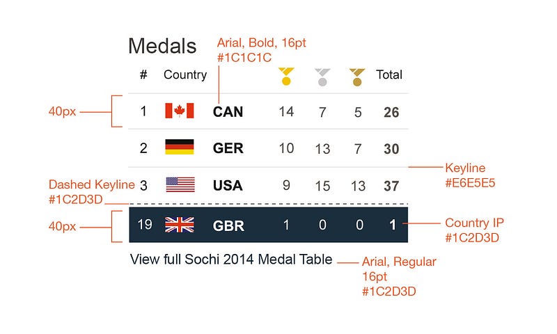
Something I have learnt is that very rarely do static design mockups easily translate into a responsive website. There are so many nuances and factors that it is just not possible to consider when using static tools like Illustrator or Photoshop.
As well as the process of producing static designs, the design team always seems to be a few months ahead of the engineering team. Meaning there was very little opportunity to truly collaborate or get designs into the browser at an early stage.
Both of these processes meant it was very difficult to try and implement the architectural changes we wanted to make. So building bridges with UX was paramount.
Death of the redline
One of the first things we did was to align the roadmaps of the design team and the front end team.
Initially we simply involved ourselves in the work designers were doing so that we could provide feedback and input into designs. The more we got involved with the design team the more it made sense that the front end team should also be working on the same things at the same time.

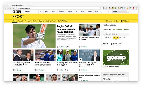
By the time we got round to working on our final responsive pages for major sports, football and the homepage, we were entirely in-sync and these new pages where largely designed in the browser.
This approach was really efficient and we quickly got pages into beta. Allowing us to get feedback from users so that we could evolve the designs based upon actual user feedback before they where fully launched.
Is it worth it?!?
I’ve found myself asking this to the UX team a lot. Maybe I’ve given a design and one element had 10px space at the bottom. Why 10px? Everything else across the site is based off an 8px baseline, why is this space 10px? Is that extra 2px worth the bespoke style needed to apply it? Will the user notice that extra 2px?
In isolation this kind of questioning approach might seem a bit extreme, however simply accepting rules which go against the established standards of codebase sets a precedent that its ok to add rules like this. We’re then in a situation where these kind of rules proliferate throughout the codebase and things can quickly spiral out of control.
Will the user notice an extra 2px? Unlikely. Will the user notice the website getting slower because we have an unnecessary amount of CSS? More likely.
This should not be seen as a process of us simply saying “no” to designs, its a process of education. Explaining the reasons why we’re saying “no”, explaining what we’re trying to achieve with our front end, how it will benefit the users because its performant and consistent and how it benefits us through maintenance and the speed at which we can produce new features.
Exposing designers to code
Education is a key steps in building bridges with UX designers, at the end of the day both teams want to achieve the same things.
As part of the process of educating designers to our code architecture and how we approach building their designs is to expose them to the code itself. I imagine at first for a designer this can be intimidating. The BBC Sport website consists of nearly 30,000 lines of Sass alone.
However, through coaching and knowledge sharing we reached a point where UX started to open pull requests to make changes themselves.

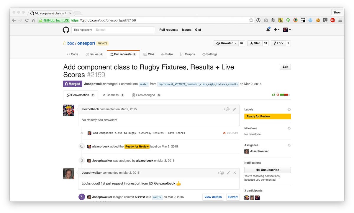
This pull request might only have been simply adding a class on some HTML but this was a massive step forward in our relationship with our designers.
This soon progressed to entire HTML and CSS pull requests. Designers piecing together patterns and abstractions which already existed in the codebase. UX completed their own colour audits across the entire codebase to ensure all colours used aligned to our colour palette and where referenced from Sass variables.
I strongly believe that designers having knowledge of how code works and how what they design gets interpreted into code effects the decisions they make when designing. I asked the designer who created the above pull request: “Would you say that when you got involved with code it changed the way you designed? or the way you thought about it?” His response:
100000000%, One of the best things I’ve done I think. Makes you a more informed, logical and efficient designer. And it means you come to the table with ideas you know will work.
This has been a great success for us and something we’re extremely proud of. We do not expect all our designers to write code and submit pull requests but we certainly want to encourage designers to have an understanding of code and it shouldn’t be seen as a black box.
To be continued
This is only really the start of the story of CSS at BBC Sport. In the next post I want to talk about how we’re taking these principles and applying them to BBC LIVE our online live coverage platform and how through our new framework, Grandstand, we’re creating new components which can exist outside of the BBC Sport codebase.