Butt-Booking — Medium
Save article ToRead Archive Delete · Log in Log out
11 min read · View original · medium.com/@hopper_travel
Butt-Booking
Or, How to Accidentally Sell Things on Mobile

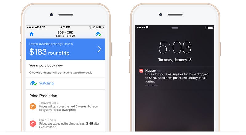
The Hopper app analyzes billions of flight prices daily to predict how they are going to change and when are the best times to fly, and “watches” flights to notify you when to buy your tickets.
As outlined in The Notification Problem, “watching” is a central part of Hopper’s product strategy. Watching a trip is a really useful tool for savvy travelers: It means they can go on living their lives while we do the heavy lifting of keeping an eye on their trips’ prices and notifying them when prices drop to our predicted low (as well as alerting them about good deals and flash sales). And for us, the feature has important engagement hooks, as users who watch a flight are much more likely to return to the app than those who do not.

But what is the ultimate point of watching and engaging with the app? Users watch trips so that they can get a good deal or the lowest price on airfare, meaning that they (usually) intend to book the flights they watch. Focusing our energy on improving the front of the flow — i.e., watching — helped reduce “our time to WOW,” driving up short-term engagement and retention metrics. But these efforts only served half of our app’s use cases. Addressing the back of the flow and how users “lock in” their good prices will in time decide our long-term usefulness, retention, and “completeness” on mobile. So we set out to improve our booking handoff, or how we transition the user from shopping to buying.
The Importance of Handoffs
As we mentioned in “Waiting is the Hardest Thing,” good flight prices are often found as a result of volatility and can change from hour to hour. This means that when Hopper sends users push notifications about prices reaching their predicted lows, they have a short and often unknown window until those prices fluctuate again. Users can lose out on a great deal if they do not act quickly, and, in a worse case scenario, pay more than if they would have just bought that flight earlier. Anything that limits the ability of the user to act decreases the chance of them locking in the prices we predict.
A user not getting a good price or paying more than when they started watching a trip risks the user’s overall experience buying flights. Even if this isn’t a result of the quality of our prediction and notifications — our core app features — the user is still likely to associate our product with the negative feelings of that experience. Limiting that risk became a priority, and our existing handoff limited the user’s ability to act and lock in a good deal.
The Problem with Handoffs
Not unlike Kayak or Hipmunk, for example, our existing handoff linked users to a web view of the site where the prices were found (often the airline or an online travel agency). From there, the user would fill in the forms and complete the booking.

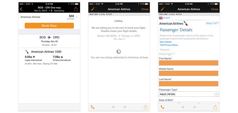

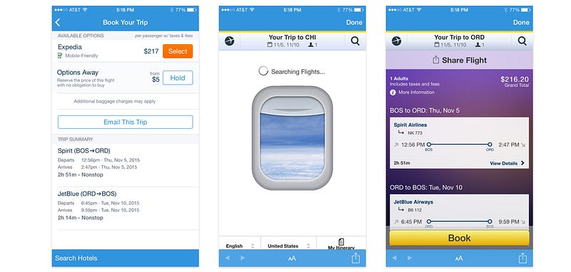
The problem with loading a web view was that the process was often slow, and by “exiting” the user from the app into the web, we lost control of the quality of the user experience on all fronts. Many airline’s websites are not optimized for mobile and are extremely frustrating to use; they increase the amount of time it takes to book on mobile (vs. on the web) and they ultimately hurt our conversion numbers, as users abandon Hopper and either never book at all or book later (on mobile or on a desktop computer) at a higher price. As a mobile-only company, the idea of users needing to leave the app and re-search for the flights on their desktops or laptops stung. Moreover, the thought of missing a deal eroded our value prop.

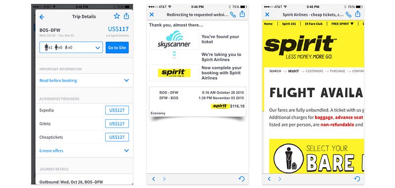
Taking the user from the app and into the web also meant we lost out on important conversion data, such as how many users complete the process post-exiting as well as what parts of the booking funnel had higher or lower friction than others. This data could then help us create a better experience for the user overall. We were not only sending users into an unknown universe, but we were flying blind after we sent them.
Amazon’s 1-Click Ordering
The more we came to understand the problem we were trying to solve, the more we realized it was not just about how we build a booking engine. Rather, it was about whether or not we could ultimately build a better way to book flights on mobile. Could we actually improve the buying experience in the process? It was a lofty and intimidating goal for us.
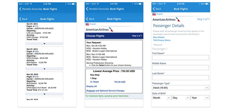
We looked for other examples in airfare but were often disappointed in the mobile experience, with online travel agencies doing the very same thing from which we were seeking to distance ourselves. Booking with the airlines directly on mobile surfaced text-dense forms and content-dense screens that lacked focus and often failed to meet many best practices for usability and simplicity.

There were, however, interesting examples ad nauseam outside of airfare, with companies such as Airbnb, Uber, and Amazon creating successful and relatively painless e-commerce funnels. This led us to think, what if we could bring the simplicity of, say, Uber or Amazon to booking flights? Amazon has patented the process of what they call “1-Click Ordering,” which makes it easy to bypass the shopping-cart flow and buy an item immediately based off of payment and shipping information previously selected by the user.

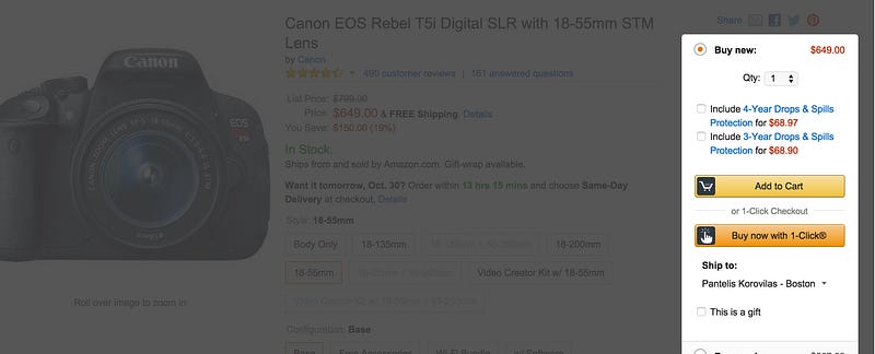
We asked ourselves: What is our equivalent to 1-Click Ordering?
Hopper’s QuickTap Booking
After racking our brains over the question, we came to an answer that was so simple, so obvious, that it seemed almost silly: strip down the booking flow to its bare essentials.
The question that followed was, what are the essentials? We realized many fields or selectors in flight-booking flows were used for upselling, there to gain data for marketing or sales, or were carried over, seemingly blindly, from precedent. Much was superfluous. We figured, if we could pare booking down to its core elements, we would reduce friction and improve on the ease of use.
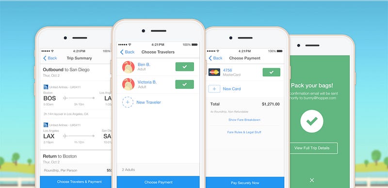
What we came to was simpler than we thought we could achieve, with two to three main steps: initial signup, choose travelers, and choose payment.

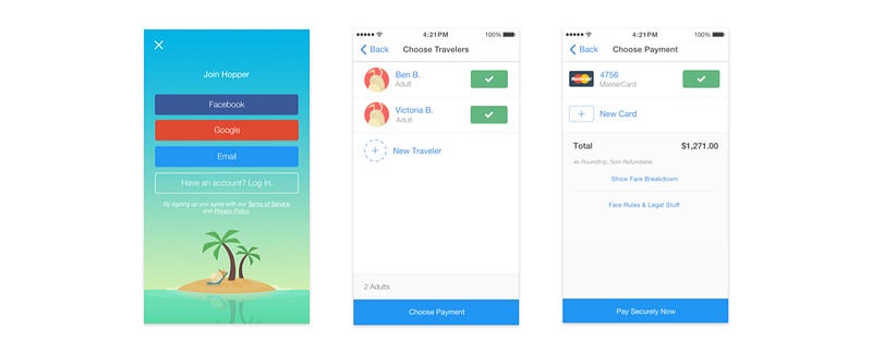
What this basic architecture did was allow us to make use of the principle of progressive disclosure, or as the Nielsen Norman Group defines it, deferring “advanced or rarely used features to a secondary screen, making applications easier to learn and less error-prone.” We were able to make the selection screens for the two core parts of the booking process refreshingly simple, with more info only when you need to add or edit your traveler or payment method.

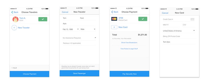
Entering your information is unavoidably more complex — even after doing our due diligence by removing extraneous fields — so we gave these screens a lot of white space to lighten them up. After entering this information once, users returning to the app could book again in less than a minute (or as fast as 15 seconds) without the need to re-enter or even see those form fields. The range depended on how prepared the user was when going through the flow, but one could easily go straight from their flight details to their confirmation screen in four taps!

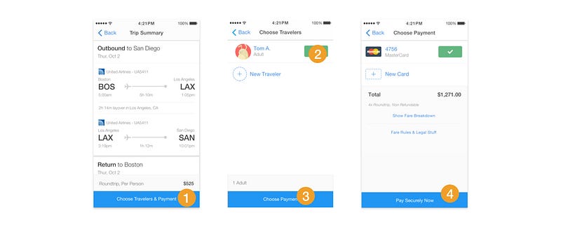
We called it QuickTap Booking, and we were really excited for how simple and lightweight it felt.
Butt-Booking
User and beta testing for this new flow confirmed our hopes, with user comments like “I LOVE the booking experience” and “It rules.” We didn’t anticipate, however, that it was possible to build a flow that was too easy when it was out in the wild.
Somehow, we achieved just that.
It was so easy, in fact, that despite language of “Pay Securely Now” on the button of the final screen, people actually booking flights expected another step in the process and would press the “Pay” button assuming there must be another screen after.

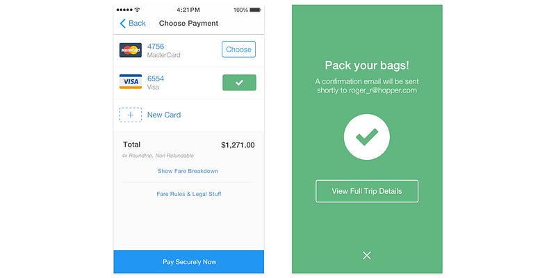
Or, in a few instances, users would press the “Pay” button accidentally; we called this phenomenon butt-booking, just like the problem once reserved for dialing recent callers from the pocket of your pants. I even experienced this myself the first week of our release, and I designed it! Our Director of Communications, Brianna, did something similar, in which she left the payment screen up on her phone, had put her phone in her bag, and something pressed and triggered the “Pay” button. We were initially pleased, and then frightened, at how easy this process was.
We determined the combination of expectations set by other flight-booking engines for length and level of complexity, the lack of a significant differentiator for the blue “Pay” button from the buttons on screens immediately preceding it, and the ease of triggering its final state made our booking flow far easier than we expected … to a fault.


Context, Security, and Friction
Through the process of analyzing behavioral data, we also learned that we didn’t balance the bare essentials required to book a flight with the necessary level of information that would make people comfortable enough to book. We saw a lot of users jumping back and forth in the funnel, going from payment selection back to traveler information, back to trip summary, and forward again. This behavior suggested that users were going back to see information about their itineraries that they had forgotten in the process, likely fearful of losing their data when they returned. Some users dropped off the funnel completely before finishing. An unknown number of those users likely intended to book before they lost confidence and swiped back.
To address both the dangerous ease of conversion and the confidence issue, we opted to make an additional screen right after the payment step, in which a user could review all of the details of his or her flight.

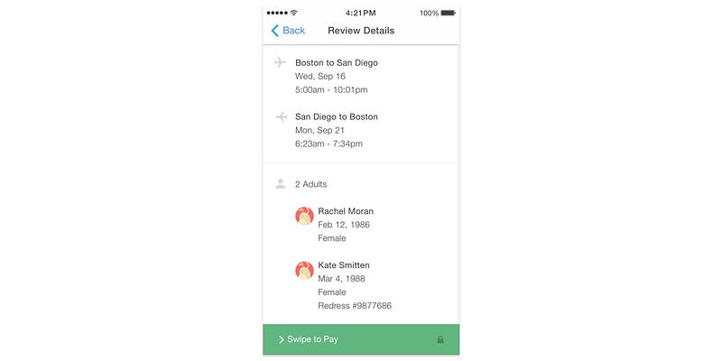
Here we colored the payment button green to differentiate it visually from the blue buttons previously seen in the flow, to warn the user that they were going to take a more significant action than on previous screens. We also made it a swipe, rather than tap, interaction to decrease the number of accidental taps.


A lock icon replaced the words “securely” on the button so we could make room for the extra words associated with the swipe interaction. To set us up for the new screen, we relabeled the blue button on the prior screen to “Review Details.”
Better Booking
We were nervous that this added screen and friction would lead to a 10%+ decrease in conversion, but we were pleasantly surprised to see it comfortably below that margin, with a notable decrease in the amount of back and forth we were seeing before. We’ve also started to see a lower percentage of support resources tied up on accidental bookings. Put in the context of week-over-week growth in bookings, we are super excited about what we created with QuickTap Booking in iOS and are working hard to add it to Android soon.
This process made it clear that with determination, initiative and the right team, it is possible to build better e-commerce flows in mobile categories that are often neglected; for us, that was flights. In today’s mobile landscape, users reward it, so aim high, friends, aim high.
-Pantelis Korovilas (@pantelisak), Lead Product Designer at Hopper
You can find Hopper for iOS on the App Store.
Interested in becoming a part of the Hopper team? We’re currently looking for a UX product manager!