16 CSS Lessons via Post-it® Notes — Prototyping: From UX to Front End — Medium
Save article ToRead Archive Delete · Log in Log out
2 min read · View original · blog.prototypr.io
16 CSS Lessons via Post-it® Notes
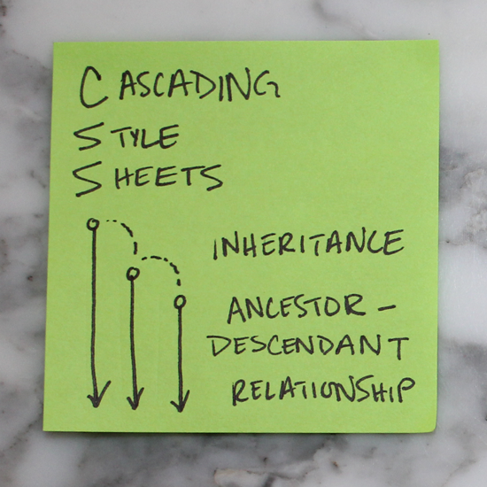
- Cascading Style Sheets Operate on Inheritance
CSS has a ancestor-descendant relationships. Anything previously defined by an ancestor will automatically be inherited by one of its children unless otherwise specified.

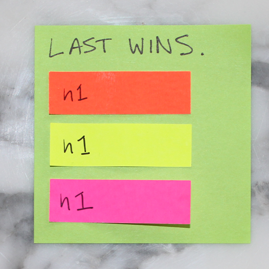
2. Last Wins
If an element is defined in more than one place within CSS, the last definition overrides the previous. (If these stickies represented colors we styled our h1’s, the h1 would appear pink.)

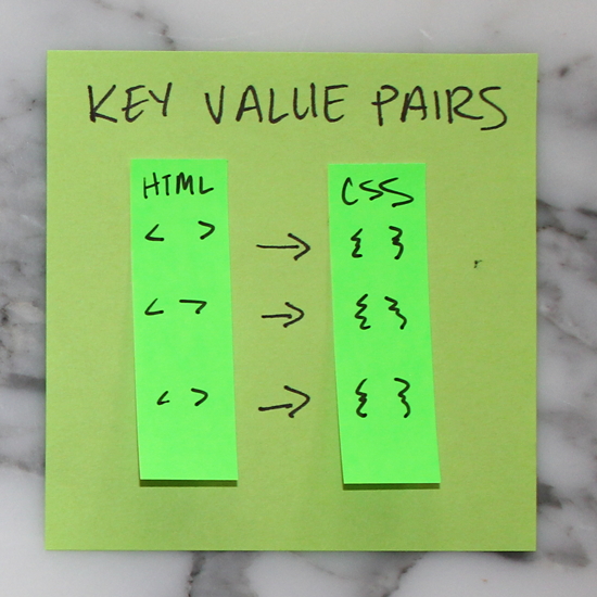
3. Key Value Pairs
For every HTML element to be styled, a corresponding CSS selector must be assigned. They always appear in key value pairs.

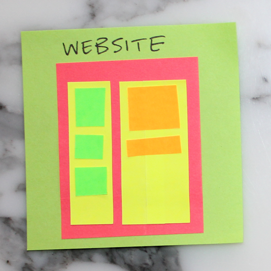
4. Layout
Websites can be broken down into components or divs for layouts. It is helpful to conceptualize the overall structure of a website before writing HTML or CSS.

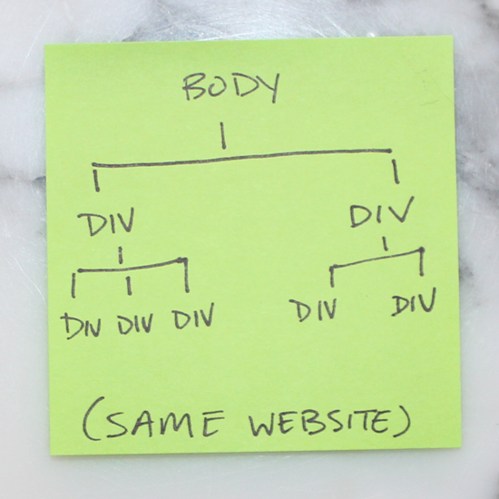
5. Tree Structure
Likewise, structuring a site also follows the tree methodology. This sticky illustrates the one above in tree-branch form.

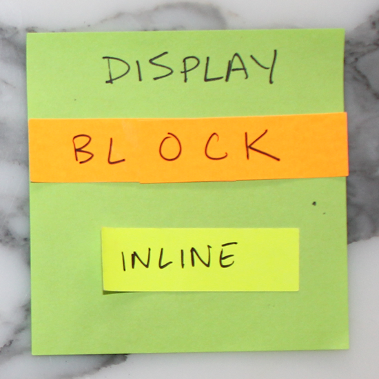
6. Block vs. Inline
Elements that stretch across the full width of a page are block elements. A few block elements include headers, footers, headings (h1, h2, h3, etc.), divs, paragraphs (p). Inline elements only take up as much room as they need to; span, links (a), and images are a few examples.

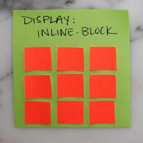
7. Inline-block
There is also such a thing as setting display: inline-block to create a uniform grid. Inline-block elements can have a height and width.

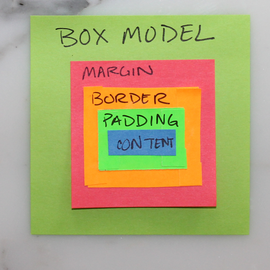
8. Box Model
All CSS elements are based on this model. The innermost box is content (could be anything), immediately surrounding content is its padding, then border, and finally, the outermost box–margin.

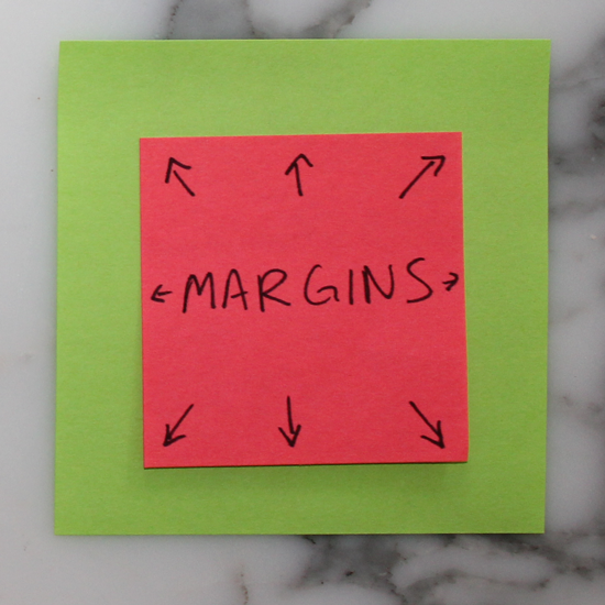
9. Margins Outside
Margins push out around an element. Margins are considered to be outside of the element, and margins of adjacent items will overlap.

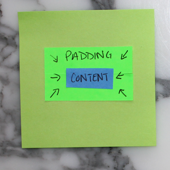
10. Padding Inside
Padding pushes inward on content. Use padding to move the contents away from the edges of the block.

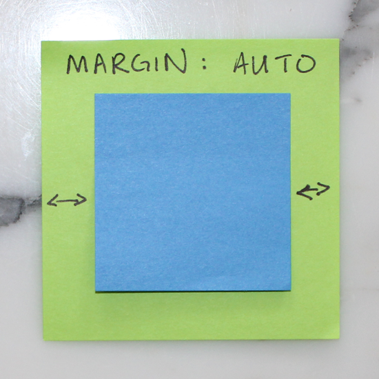
11. Auto Margins
Setting margins to auto for right & left is a handy way of centering.

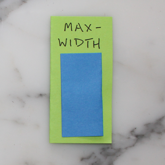
12. Max-width
Max-width prevents the value of the width property from becoming larger than max-width. This is especially helpful when designing for smaller screens (like mobile!)

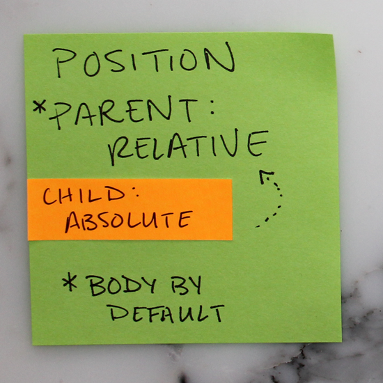
13. Relative and Absolute
Set a parent element to position: relative and its child to position: absolute to position the child within (or relative) to its parent. Note that the parent is always body by default.

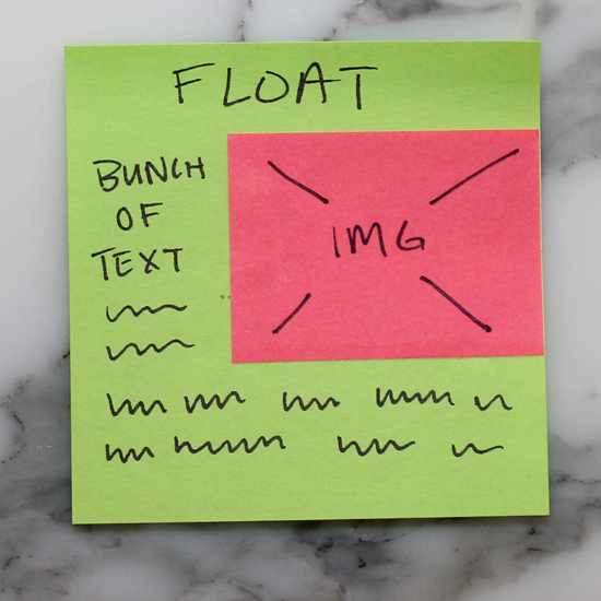
14. Float
Setting an element to float, like the img below for example, will allow the text to flow around it.

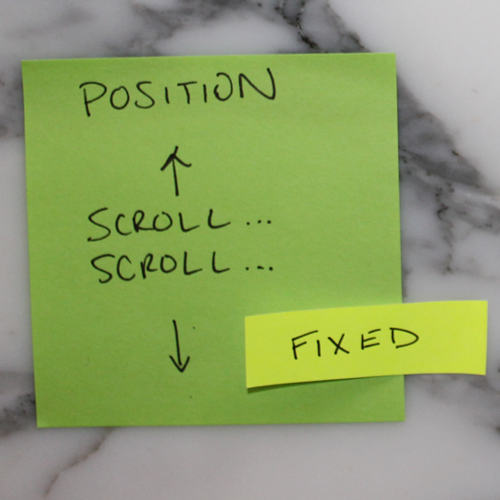
15. Fixed
Fixed elements are exactly that, they are always fixed to the same spot, regardless of page position (scroll).

16. Link up your style sheet!
If you don’t link your style sheet in the header of your HTML, your website will be sad, and probably unattractive. 😥
<link rel=”stylesheet” href=”./css/style.css”>